Preview image. Unlock full-res
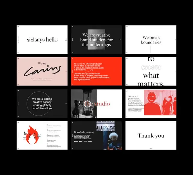
A 3x4 grid of branded presentation slides for Sid, a creative agency, mixing white, dark, and red cards with serif and sans-serif headlines.
Summary
A modular 12-slide grid system for Sid, a creative agency, built from alternating white, black, and warm-toned cards, each card showcasing the brand voice through headlines, mission statements, and photography.
Visual description
Twelve presentation cards arranged in a 3x4 grid against a black background. The top row shows "sid says hello" (white card, serif), "We are creative brand builders for the modern age" (dark card, white text), and "We break boundaries / to create what matters" (white card, serif, split over two cards). The second row includes a blush-pink card with "We are caring" in script, a striking red card with small justified text, and continuing headlines. The bottom row mixes dark backgrounds with circular geometric compositions, black-and-white photography, and typography. Color accents include warm coral/salmon tones, a signature bright red, soft pink, and deep grays. Photography (where present) is desaturated and documentary in style. Typefaces are clean sans-serif for body text and mix of serif and script for headlines.
Key takeaway
The modular grid system that lets each card stand alone visually while maintaining coherent brand voice across the set. The restrained use of one accent color (red) against an otherwise neutral palette creates visual hierarchy and brand memorability. The mix of typographic treatments (serif headlines, sans-serif body, script accent) conveys a creative yet professional identity without chaos.
Reuse notes
Ideal for creative agencies, consulting firms, and marketing-focused brands that need to show their personality across multiple brand touchpoints. The card format works well in pitch decks, lookbooks, or brand presentations. Works less well for conservative B2B or finance where the serif + script combination might read as too playful.
More like this








Keep what you find
A free account saves references to boards and can send you a weekly email of picks based on what you save.
To see every result, go Pro.