Preview image. Unlock full-res
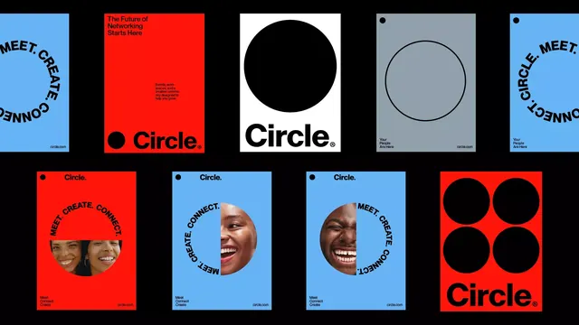
Bold, high-contrast brand identity system using a solid circular mark in red and blue, paired with all-caps sans-serif type and circular portrait photography cutouts.
Summary
A brand identity system for Circle, a networking platform, featuring a bold geometric primary mark (solid circle) in vibrant red and blue, paired with tight all-caps sans-serif headlines and circular portrait crops that integrate people directly into the mark.
Visual description
A grid showcasing multiple brand applications: the top row displays large hero cards (red with black circle on white, white with black circle) and variations with blue backgrounds. All layouts pair the tagline "MEET CREATE CONNECT" (often curved around or alongside the circle) with the Circle logotype. Lower examples integrate large circular photographic crops of smiling people into colored backgrounds (red, blue) with the same type treatment. The color palette is deliberately limited and saturated: true red, bright blue, black, and white, creating maximum contrast and legibility. The sans-serif is modern, bold, and all-caps throughout, emphasizing clarity and confidence.
Key takeaway
The simplicity and flexibility of a single geometric form (the circle) repeated across multiple contexts and scales. Using portrait photography as a structural design element, not merely decorative, with the face enclosed by the brand's signature shape. The confident constraint of a two-color plus black/white palette that remains bold and distinctive across any layout.
Reuse notes
Ideal for community-driven or membership platforms, networking apps, or social SaaS. The circular mark and people-centric integration work well for platforms emphasizing connection and trust. The high contrast and all-caps type project confidence and energy; pair with generous spacing around the mark if visual clutter is a concern.
More like this



Keep what you find
A free account saves references to boards and can send you a weekly email of picks based on what you save.
To see every result, go Pro.