Preview image. Unlock full-res
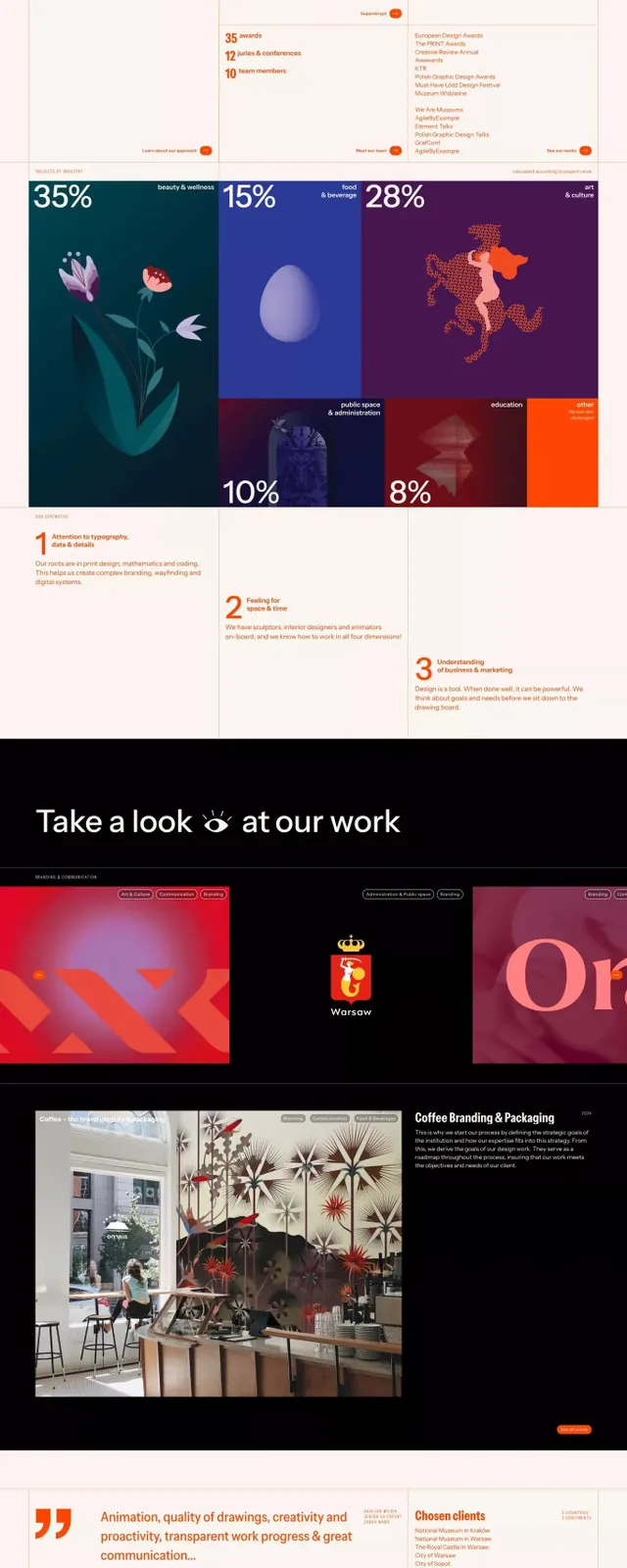
Design agency website showcasing three core services (design, thinking, visual) with vibrant orange callouts, dark section dividers, illustrated case studies, and client testimonials.
Summary
A design agency portfolio site organized around three pillars (Design, Thinking, Visual), using oversized numbers, colored section breaks, illustrated case studies, and a testimonial section to showcase work and process.
Visual description
The site uses a clean beige/off-white background with dark navy and orange as primary accent colors. The header features a small orange logo (stylized mark) at top-left and navigation. Three main service columns are introduced with oversized orange headings and explanatory text in small sans-serif. A large "13" serves as a visual anchor in the middle section. Below, a dark navy divider contains illustrated icons and percentages (35%, 15%, 28%, 10%, 8%) in white text, showing project distribution or team skills across different colored illustration panels (teal, blue, purple, orange). A three-point numbered breakdown section follows. The lower third shows a "Take a look at our work" section with dark background and thumbnail case studies (vibrant gradient abstract images, black background with shield logo, photography of a retail space). At the very bottom, a bright orange band contains the headline "If you like it, then you should put a ring on it" in white sans-serif with social icons.
Key takeaway
The three-pillar service structure with consistent naming and icon treatment. The numbered-percentage breakdown with color-coded illustration panels as a composition technique. The dark divider sections creating visual rhythm and breaking up the light background. Oversized display numbers anchoring key metrics or emphasizing scale.
Reuse notes
Effective for consulting, agency, or professional services sites that need to convey expertise across multiple domains. The contrast between light and dark sections prevents monotony on text-heavy pages. The orange accent is applied sparingly but creates memorable focal points. Works well when paired with case study grids or portfolio galleries.
More like this




Keep what you find
A free account saves references to boards and can send you a weekly email of picks based on what you save.
To see every result, go Pro.