Preview image. Unlock full-res
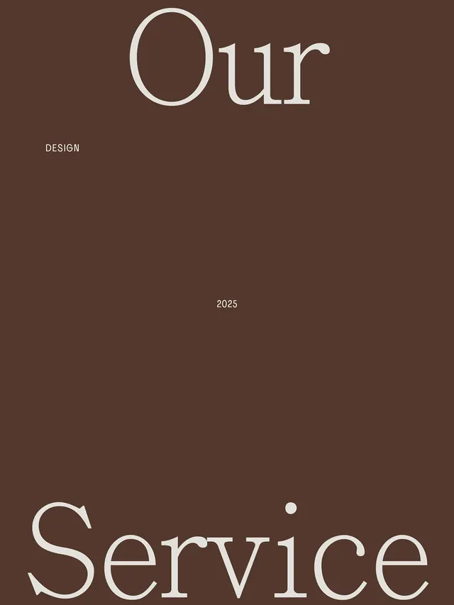
A type-specimen layout for 'Our Design Service' split across two lines, set in elegant serif typography on a warm dark-brown ground with generous vertical spacing.
Summary
A branding system layout pairing a serif display typeface with minimal supporting text across a tall vertical composition set on a warm dark-brown background.
Visual description
The composition is portrait-oriented with a dark warm-brown (#54382D) background. In the upper third, "Our" appears in an oversized, high-contrast serif typeface with generous letter spacing, set in cream (#E8E8E2). Below it, the word "DESIGN" appears in small caps, muted sans-serif, left-aligned. Near the vertical center is a thin horizontal line and the year "2025" in small serif text, creating a visual dividing point. In the lower third, "Service" appears in the same oversized serif as "Our", anchored to the bottom. The vast empty space between elements emphasizes the typography's weight and elegance.
Key takeaway
The two-tier serif treatment using scale contrast without weight variation. The year mark as a temporal anchor between major text elements. The generous vertical breathing space that lets each typographic element stand alone yet maintain cohesion through color and serif choice.
Reuse notes
Ideal for design studios, luxury brands, and editorial projects where refined restraint communicates premium positioning. The layout adapts well to business cards, poster series, or environmental graphics. The warm dark background is essential; the hierarchy depends on typography scale rather than color variation.
More like this



Keep what you find
A free account saves references to boards and can send you a weekly email of picks based on what you save.
To see every result, go Pro.