Preview image. Unlock full-res
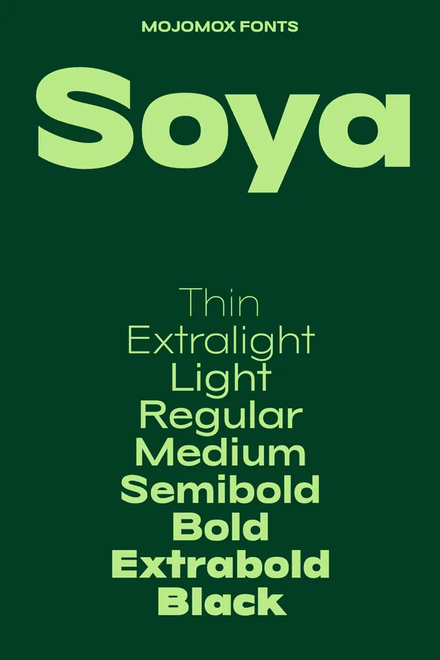
A geometric sans-serif typeface showcased through a full weight range (Thin to Black) in lime-green text against a deep forest-green background, demonstrating the font's versatility across weights.
Summary
The Soya typeface (Mojomox Fonts) displayed at large scale across eight weight variations, from Thin to Black, printed in lime green against a deep teal background.
Visual description
A single-image specimen card with "MOJOMOX FONTS" label in small lime-green capitals at top. The word "Soya" dominates the upper half in oversized lime-green letterforms with slight variations in letter width (especially the capital S) that signal the typeface's geometric character. Below, a stacked column lists eight weight labels in progressively heavier lime-green type: Thin, Extralight, Light, Regular, Medium, Semibold, Bold, Extrabold, and Black. The background is a solid deep forest green (approximately Pantone 561C). The contrast between the bright lime/chartreuse type and dark teal ground creates visual intensity while maintaining legibility. Layout is centered and symmetrical, emphasizing the vertical rhythm of the weight cascade.
Key takeaway
This type specimen uses pure contrast color to showcase weight variation: a single bright hue at multiple opacities and weights against a cool, dark background is far more readable and elegant than rendering every weight in the same size. The clear vertical stacking of weight labels makes it instantly clear what you're looking at. The centered, spare composition draws all attention to the letterforms themselves.
Reuse notes
Effective for any sans-serif typeface with a diverse weight family. Works well in brand guidelines, font foundry portfolios, and type-forward design systems. The green-on-green palette is trendy but specific; adapt the colors to match your brand's palette while keeping the high contrast for legibility.
More like this



Keep what you find
A free account saves references to boards and can send you a weekly email of picks based on what you save.
To see every result, go Pro.