Preview image. Unlock full-res
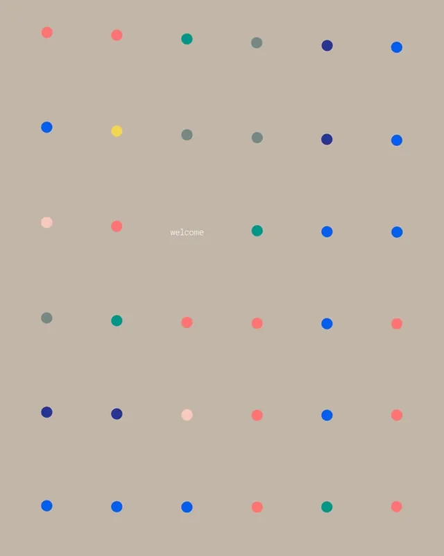
Identity system using scattered colored dots on a muted tan background, with the word 'welcome' placed centrally, suggesting a minimalist pattern language.
Summary
Identity system using scattered colored dots on a muted tan background, with the word 'welcome' placed centrally, suggesting a minimalist pattern language.
Visual description
Loose grid of small circles scattered across a warm muted tan background. Dots in bright saturated colors: coral pink, teal, navy blue, soft pink, yellow, and muted grey. The placement is rhythmic but asymmetrical, avoiding rigid alignment. Small word 'welcome' in light sans-serif appears centered, integrated into the dot pattern. The contrast between the calm neutral background and vibrant dots creates a friendly, approachable feeling despite the system's geometric structure.
Key takeaway
Scattered rhythm within a loose grid avoids rigid uniformity while maintaining coherence. Saturated accent colors on a muted neutral ground creates visual pop and focal points. Minimal text integration lets the pattern speak visually. The system scales easily for applications, collateral, or digital interfaces.
Reuse notes
Strong for tech, SaaS, or consumer brands seeking a modern yet warm identity. The scattered-dot pattern works well for data visualization applications, app interfaces, or pattern-heavy collateral. The calm palette lends trustworthiness while vibrant accents add energy. Not suitable for formal or luxury brands that require stricter geometry.