Preview image. Unlock full-res
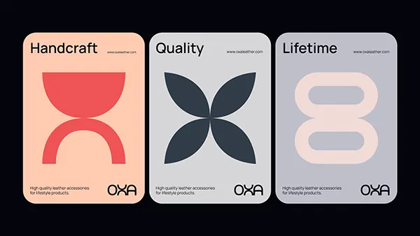
Three rounded-corner cards presenting brand attributes (Handcraft, Quality, Lifetime) with simple geometric icons on muted pastel and neutral backgrounds.
Summary
A three-card system conveying product attributes (handcraft, quality, lifetime value) through single bold geometric icons and descriptive sans-serif headlines on soft muted backgrounds.
Visual description
Three rounded-corner cards arranged horizontally on a dark charcoal background. Each card features a pastel field (peach, white, pale lavender) with a large geometric icon centered in a complementary hue: a red semicircle and arc (handcraft), a navy four-pointed star (quality), a blush rounded rectangle pair (lifetime). Above each icon sits a single sans-serif word headline (Handcraft, Quality, Lifetime) in black. Below, a caption line in small type explains the concept ("High quality leather accessories for everyday products"), and a small white mark (OXA logotype) anchors the bottom right. Icons are simple, flat, and architectural. The color palette is intentionally soft and sophisticated, avoiding primary brights.
Key takeaway
Reducing complex product benefits to a single geometric icon that can live alone or paired with one word. Soft, desaturated backgrounds (not white) convey premium quality without coldness. Pairing a bold headline with minimal explanatory copy creates breathing room and makes each card scannable at a glance.
Reuse notes
Ideal for lifestyle, luxury goods, or accessories brands. The geometric shapes are abstract enough to adapt to different verticals. If your product line is larger, extend this to four or six cards; the same rhythm holds. Works well on websites, packaging, or printed collateral. The small supporting copy is not a liability; it reinforces the brand story without clutter. Avoid photographic elements; this system's strength is its geometry and color restraint.
More like this








Keep what you find
A free account saves references to boards and can send you a weekly email of picks based on what you save.
To see every result, go Pro.