Preview image. Unlock full-res
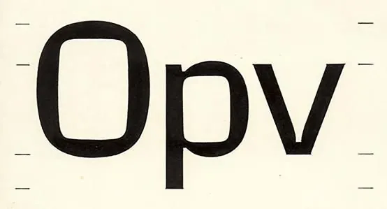
Typographic specimen of bold, uniform-stroke geometric letters with mechanical cap lines, set against a warm cream background.
Summary
Typographic specimen of bold, uniform-stroke geometric letters with mechanical cap lines, set against a warm cream background.
Visual description
Centered composition featuring three large capital letters in a heavy, geometric sans-serif with uniform stroke weight. Letters have squared terminals and cleanly rounded junctions. Thin horizontal cap and baseline rules flank the letters top and bottom, emphasizing precision. The cream background provides warmth against the solid black letterforms, creating stark high-contrast legibility. The geometric construction and mechanical detail suggest a font study or type specimen page.
Key takeaway
Uniform stroke weight across curved and straight strokes creates visual consistency. Cap lines establish a formal grid. The high contrast of black on cream is legible yet warm. Centered layout with generous space around the letters emphasizes the form itself.
Reuse notes
Effective for showcasing geometric typeface characteristics or building technical, corporate identity systems. The mechanical precision works well for architecture, engineering, or tech brands. The warm cream background prevents coldness; pair with minimalist branding. May not suit playful or organic aesthetic directions.
More like this



Keep what you find
A free account saves references to boards and can send you a weekly email of picks based on what you save.
To see every result, go Pro.