Preview image. Unlock full-res
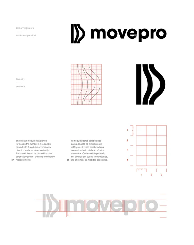
Movepro brand identity uses a striped wave-form mark paired with modular grid construction rules, bilingual (English/Portuguese) documentation, and precise geometric guidelines.
Summary
Movepro brand identity uses a striped wave-form mark paired with modular grid construction rules, bilingual (English/Portuguese) documentation, and precise geometric guidelines.
Visual description
Brand guideline page showing the Movepro identity system: top features the black wordmark paired with a striped wave-form mark composed of parallel vertical lines. Middle section shows the mark's anatomical construction (anatomia) with a red-outlined grid revealing the underlying proportional system, next to the solid black mark and a detailed construction overlay. Bottom includes bilingual explanatory text (English/Portuguese), a measurement grid with numbered axes (1-4 vertical, 1-3 horizontal), and scale ruler. The palette is restricted to black, white, and coral-red (#FCE6E4) for construction overlays. Typography is uppercase sans-serif with precise alignment marks.
Key takeaway
The striped mark that creates visual rhythm and personality while staying minimal. The dual-purpose construction grid that both teaches proportion and looks sophisticated as a design artifact. The use of red as a functional accent (showing grid and measurements) that doesn't require changing the core black-white palette.
Reuse notes
Excellent reference for tech or movement-related brands seeking a geometric, dynamic mark. The bilingual approach is useful for international brands. The construction documentation style (with grid overlay, measurement system, and anatomical breakdown) is strong for detailed brand guidelines. Test the striped mark at small scale to ensure line weight maintains legibility.
More like this




Keep what you find
A free account saves references to boards and can send you a weekly email of picks based on what you save.
To see every result, go Pro.