Preview image. Unlock full-res
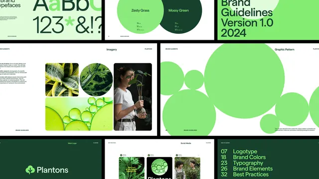
A brand guidelines and packaging design system featuring lime green and dark forest green accents over white and black, with circular organic shapes and nature imagery.
Summary
A nature-forward brand system for "Plantons" using bright lime green and dark forest green with circular organic shapes, nature photography, and modular packaging layouts.
Visual description
Six distinct design layouts arranged in a grid showing a brand identity system. Top left: black background with a sans-serif logotype in lime green marked "AABD" with a registered mark. Top middle and right: "Brand Guidelines Version 1.0 2024" headers in lime green, with circular typography and wavy organic outlines. Middle row: a grid of nature photographs (close-ups of leaves, water droplets, botanical subjects) paired with overlaid circular green shapes and sans-serif labels. Bottom: the full "Plantons" logo in white on a dark forest-green background, followed by a modular grid layout showing photography, numbered guidelines, and color/brand-element cards. White space frames each layout block, creating a clean, breathing composition.
Key takeaway
Large, overlapping circular shapes in a single bright green create visual movement and unity across disparate sections. The combination of high-contrast dark green backgrounds with white layouts and lime green accents ensures readability and modern energy. Pairing photography with geometric circles and white space makes nature content feel designed rather than sourced.
Reuse notes
Ideal for organic, natural, or sustainability-focused brands. The bright green accent works especially well for food, agriculture, beauty, or wellness companies. The modular grid layout translates easily into printed materials, packaging, and digital guidelines. Works best on dark or white backgrounds; avoid mid-tone backgrounds where the contrast diminishes.
More like this



Keep what you find
A free account saves references to boards and can send you a weekly email of picks based on what you save.
To see every result, go Pro.