Preview image. Unlock full-res
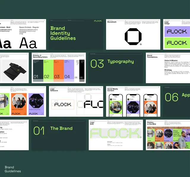
A multi-page brand guideline document for FLOCK displaying typography, a teal-and-neon color system, wordmark variations, photography integration, and mobile app mockups.
Summary
A comprehensive brand identity system for FLOCK organized across a dark teal background, showcasing structured guidelines for typography, a bold neon accent palette (lime, orange, purple), logo construction, photography treatment, and mobile app UI.
Visual description
The guideline document is presented as a grid of labeled sections, each exploring a different brand component. The top row includes a typography page (showing serif and sans-serif families), a cover page reading "Brand Identity Guidelines" in lime-green type, a logo construction diagram (black geometric form), and a secondary mark. Below, rows show the color palette (five numbered swatches spanning teal, mauve, sage, and black), photography grids demonstrating human-centered imagery with circular treatment, app mockups displaying the FLOCK interface with lime and orange buttons, and specimen pages showing wordmark applications. A dark teal, nearly black background unifies the grid, while the lime-green section headings (numbered 01-06) and neon accent colors (orange, purple, lime) create visual hierarchy and energy throughout the system.
Key takeaway
The disciplined, modular approach to presenting guidelines in a compact grid; the use of a dark background to make neon accents pop while maintaining sophistication; the integration of photography with circular/oval framing that becomes a recognizable pattern language; the restraint in the main palette (teal, mauve, sage, black) paired with bold secondary accents that feel intentional, not random. The lime-green section numbers provide scanning clarity without a separate header bar.
Reuse notes
Ideal reference for media, social, or cultural brands needing both polish and personality. The dark teal ground works well for apps and web; the circular photo treatment is particularly effective for team, community, or creator-focused platforms. The secondary neon palette can feel overstated if applied everywhere; using it sparingly on CTAs, highlights, or accent moments keeps the system feeling premium rather than loud. The structured grid approach scales to print, digital, and video seamlessly.
More like this
Keep what you find
A free account saves references to boards and can send you a weekly email of picks based on what you save.
To see every result, go Pro.