Preview image. Unlock full-res
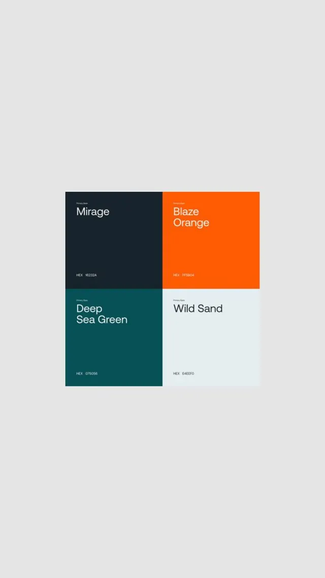
A 2x2 color-palette specimen grid displaying four named colors: dark teal (Mirage), bright orange (Blaze Orange), deep teal (Deep Sea Green), and pale off-white (Wild Sand), with hex codes for each.
Summary
A specimen card displaying a four-color palette built on warm-cool contrast: dark navy (Mirage), bright orange (Blaze Orange), deep teal (Deep Sea Green), and off-white (Wild Sand), with hex codes printed in each quadrant.
Visual description
A 2x2 grid filling most of the frame. Top-left: dark navy rectangle (#16232B, labeled "Mirage" in sans-serif) with hex code below. Top-right: bright vivid orange rectangle (#FF5B04, labeled "Blaze Orange" with white type and hex code). Bottom-left: deep teal rectangle (#075056, labeled "Deep Sea Green" in light text with hex code). Bottom-right: pale off-white rectangle (#E5E5E0, labeled "Wild Sand" in dark type with hex code). Each block is sized equally, creating perfect visual harmony. All type is set in clean, modern sans-serif (appears to be system font). The hex values are printed small within each swatch for reference.
Key takeaway
The four-color balance is instantly usable: two dark tones (navy and teal) provide depth, orange adds energy, and off-white offers rest. Presenting them as equal-weight quadrants makes it easy to see relationships and contrast ratios. Printing the hex values in-swatch removes the friction of guessing or cross-referencing.
Reuse notes
Excellent palette reference for portfolios, creative studios, or tech products that want to project sophistication with energy. The navy-teal-orange combination reads premium when the off-white is used as breathing room. Use orange as a true accent; if you need to fill large areas, let navy and teal dominate. This palette holds its contrast and legibility from poster size down to small UI elements.
More like this

Keep what you find
A free account saves references to boards and can send you a weekly email of picks based on what you save.
To see every result, go Pro.