Preview image. Unlock full-res
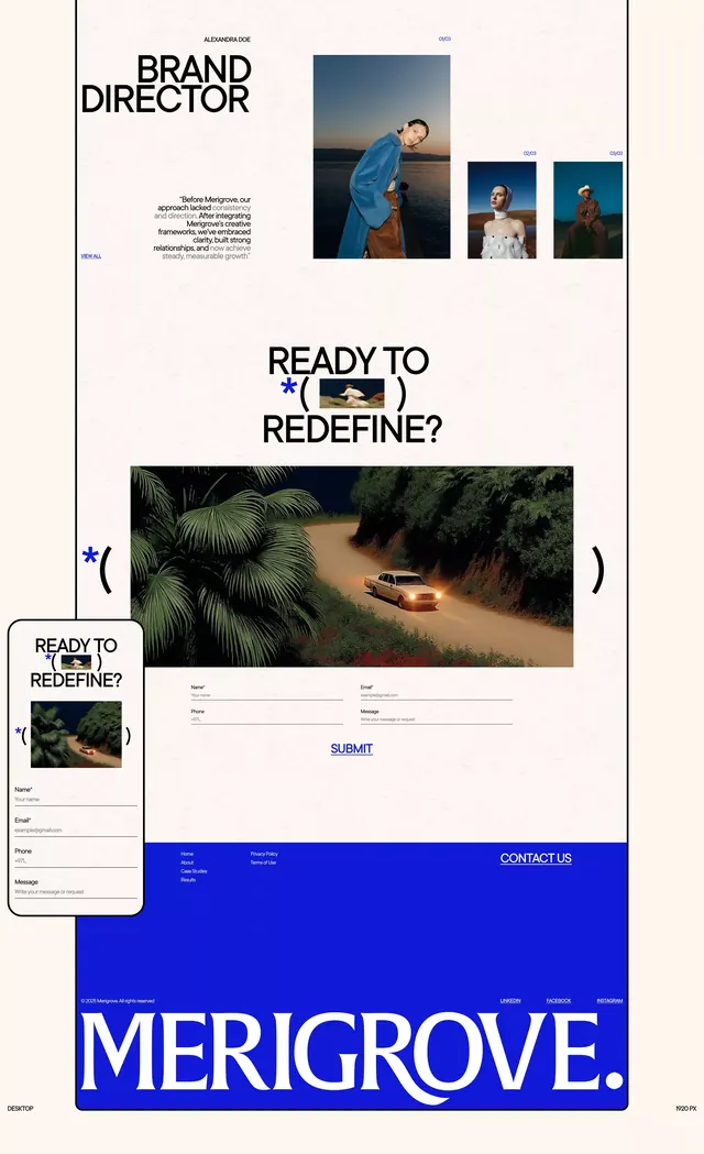
A multi-page portfolio layout mixing stark white space with cobalt blue full-bleed sections, grid-based card layouts, and lifestyle photography.
Summary
A multi-page portfolio layout alternating between cream-white grid sections with portrait photography and a bold cobalt full-bleed call-to-action with form elements.
Visual description
Vertically scrolling composition across five distinct sections. The top shows "BRAND DIRECTOR" as a left-aligned headline with a grid of three portrait photographs (lifestyle, professional dress, outdoor) arranged flush-right. A white-space-heavy secondary section frames a large question "READY TO REDEFINE?" in bold sans-serif over a lush tropical landscape photograph with overlaid form elements (name, email fields). Below, a thumbnail card-stack on the left (shown in perspective) hints at more content. A bright cobalt blue full-bleed footer occupies roughly one-quarter of the viewport, displaying "MERIGROVE." in white sans-serif and minimal contact information. Throughout, cream-white and gray tones dominate; cobalt blue appears as a single, high-impact accent tying headline typography and the footer together.
Key takeaway
The dramatic color contrast: one vibrant accent color (cobalt) used sparingly on a full-bleed section creates urgency without overwhelming. Grid-based layout with generous whitespace prevents visual chaos while photography remains the focal point. A question-form CTA ("Ready to redefine?") invites participation and implies agency/transformation. Perspective card-stack hint at depth and hidden content.
Reuse notes
Strong pattern for creative services, agency, or freelance portfolios showcasing portrait work and client-facing relationships. The brutalist, grid-heavy approach reads as intentional and refined rather than corporate. Best when you have compelling, lifestyle-forward photography and a single brand color that punches through neutrals.
More like this





Keep what you find
A free account saves references to boards and can send you a weekly email of picks based on what you save.
To see every result, go Pro.