Preview image. Unlock full-res
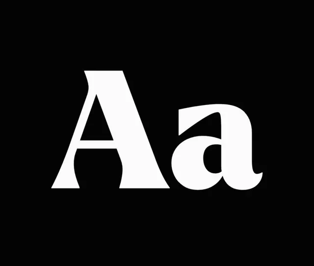
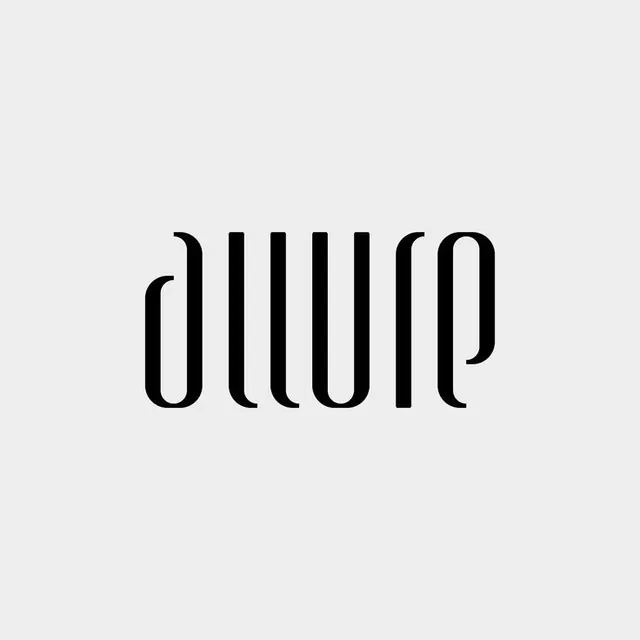
Monochrome wordmark in a custom high-contrast serif typeface with exaggerated thick-and-thin stroke variation.
Summary
Monochrome wordmark in a custom high-contrast serif typeface with exaggerated thick-and-thin stroke variation.
Visual description
The word "allure" set in a custom serif face on a light gray background. The typeface features dramatic contrast between thick and thin strokes, with characteristic serifs widening dramatically at terminals. Vertical strokes are heavy and bold; horizontal connections are hair-thin, creating a striking visual rhythm. The letter forms sit centered with ample negative space; the overall effect is contemporary yet classical, commanding attention through typographic form alone.
Key takeaway
The extreme thick-to-thin stroke contrast that reads as elegant rather than novelty; the custom serif that feels both modern and refined; the discipline of using zero color or imagery, letting the type character carry the entire brand mark.
Reuse notes
Effective for fashion, luxury, editorial, and premium consumer brands. The high contrast works best at display sizes and on simple backgrounds. Avoid pairing with visual complexity; this typeface dominates and expects breathing room.