Preview image. Unlock full-res
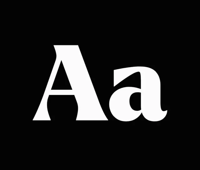
Oversized serif letterforms in pure white centered on black, demonstrating letterform structure through extreme contrast.
Summary
Two serif letterforms, "Aa", rendered in pure white at maximum size and centered against pure black, isolating typeface personality through tonal contrast alone.
Visual description
A centered horizontal composition. Two serif characters dominate the frame: a capital "A" (left) and lowercase "a" (right), both rendered in bright white against a black background with no margin. The serif family exhibits high stroke contrast, tapered terminals, and refined serifs characteristic of transitional or classical serifs. Letterform details like the counter shapes, stem weights, and serif proportions are sharply legible against the black void. No additional typography, color, or ornament disturbs the purity of the presentation.
Key takeaway
Isolating a typeface at extreme scale against pure contrast reveals letterform subtlety that gets lost at body sizes. This approach surfaces the emotional tone of the serif (classical vs. playful) better than any word setting would.
Reuse notes
Ideal for type-specimen sheets, font foundry promos, or editorial covers where typeface elegance is the message. The black background demands a typeface with confident letterforms; thin or spindly serifs will flatten. Works especially well for luxury or editorial brands positioning sophistication.
More like this




Keep what you find
A free account saves references to boards and can send you a weekly email of picks based on what you save.
To see every result, go Pro.