Preview image. Unlock full-res
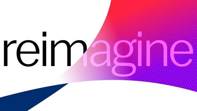
A tech-forward wordmark for 'Reimagine' with black serif letterforms half-obscured by a fluid red-to-purple gradient swoosh, anchored by a navy triangular accent.
Summary
A tech-forward wordmark for 'Reimagine' with black serif letterforms half-obscured by a fluid red-to-purple gradient swoosh, anchored by a navy triangular accent.
Visual description
Left-aligned sans-serif text spells 'Reimagine' in heavy black, with the rightmost letterforms ('agine') overlaid in soft pink and magenta lines. A large curved gradient shape sweeps diagonally from the lower left across the upper right, transitioning smoothly from coral-red through hot magenta to deep purple. The shape has a soft, blurred edge that softens the color blend. A navy triangular wedge anchors the bottom left, pointing upward, creating geometric balance against the organic curve. The white background emphasizes the saturated color contrast.
Key takeaway
The layered text-and-gradient technique, where the wordmark combines solid and outlined letterforms to let the gradient shape pass through, creates visual depth without overcomplicating the mark. The color transition is smooth and directional, suggesting motion and innovation. The angular accent shape provides grounding and prevents the design from feeling too airy.
Reuse notes
Strong for tech, SaaS, or innovation-focused brands seeking a modern, approachable wordmark that stands out in dark backgrounds. The gradient can feel dated if overused; pair with restrained secondary typefaces and a tighter color palette. The navy accent is critical for visual balance and legibility at small sizes.