Preview image. Unlock full-res
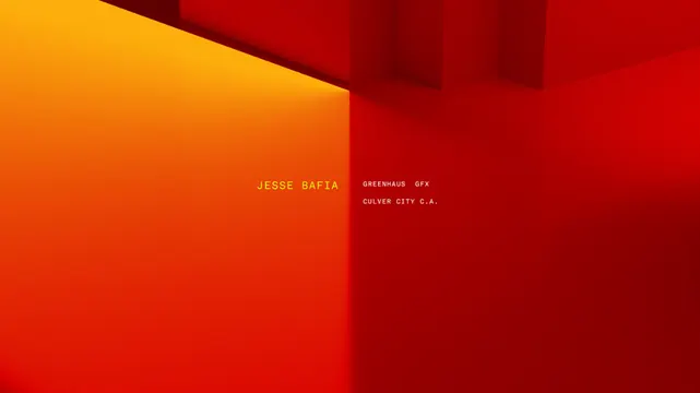
A diagonal split divides the frame into warm orange-yellow on the left and deep red on the right, with small text labels anchoring each half.
Summary
A diagonal split divides the frame into warm orange-yellow on the left and deep red on the right, with small text labels anchoring each half.
Visual description
A bold diagonal line cuts from the top-left corner toward the center-right, creating two color-blocked planes. The left triangle is a warm golden-orange fading toward yellow at the upper corner. The right field is a deep wine-red, darker and more saturated. Two small lines of justified sans-serif text sit centered in each plane: "JESSE DAVIS" with smaller detail text on the left, "ARTSINOUT SPA" and "GOLDEN CITY S.A." on the right, in light gray-white. The intersection creates sharp geometric clarity and a sense of forward movement.
Key takeaway
The diagonal as a compositional device creates dynamism without busy ornamentation. A two-color split with one warm and one cool-dark tone generates high visual impact. Small, justified text placed within each field respects the geometry and reads as intentional rather than floating.
Reuse notes
Ideal for editorial covers, agency portfolios, and brand identity work where warmth and bold geometry signal creativity. The scale and contrast allow it to work as a poster, magazine spread, or digital cover. Limit text to brief contact/credit lines to avoid visual clutter.
More like this







Keep what you find
A free account saves references to boards and can send you a weekly email of picks based on what you save.
To see every result, go Pro.