Preview image. Unlock full-res
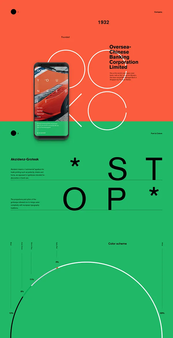
Vertical brand style sheet stacking a coral hero with phone mockup, a lime Akzidenz-Grotesk type page spelling STOP, and a circular color-scheme percentage chart.
Summary
A vertical brand case-study sheet for OCBC bank, divided into a coral-orange hero block and a lime-green type-and-color block. It chains a product mockup, a type-specimen page built around the word STOP, and a circular color-distribution chart into one scrolling identity overview.
Visual description
The top third is solid coral with an "01 / Company" header, the founding year 1932, and a stacked sans headline naming "Oversea-Chinese Banking Corporation Limited" beside a paragraph of fine copy; a phone mockup tilts over a large outlined OCBC monogram, its screen showing a "YOU NEED IT" car-finance interface. A diagonal split hands the lower two-thirds to lime green: section "02 / Font & Colors" sets a note on Akzidenz-Grotesk against the word STOP spelled in enormous black letters with two asterisks, arranged on a loose grid. At the bottom, a "Color scheme" donut chart traces a near-full ring with percentage call-outs (69%, 12%, 6%, 11%, 2%) labeling each brand color's share.
Key takeaway
Treating a brand deck as one tall poster: blocks of flat brand color do the page-breaking, so a viewer scrolls from product to typography to palette without chrome or borders. The oversized STOP set as a type specimen turns the font spec into a graphic centerpiece. The donut chart quantifying color usage is a clean way to document a palette's proportions.
Reuse notes
Good reference for brand-guideline one-pagers, Behance case-study covers, or a brand page on a site. The diagonal color split is the structural device, reuse it to hand sections to different palette colors. Pair the giant-word type specimen with a real grotesque to justify the scale. The percentage donut works whenever you need to show palette dominance rather than just swatches.
More like this





Keep what you find
A free account saves references to boards and can send you a weekly email of picks based on what you save.
To see every result, go Pro.