Preview image. Unlock full-res
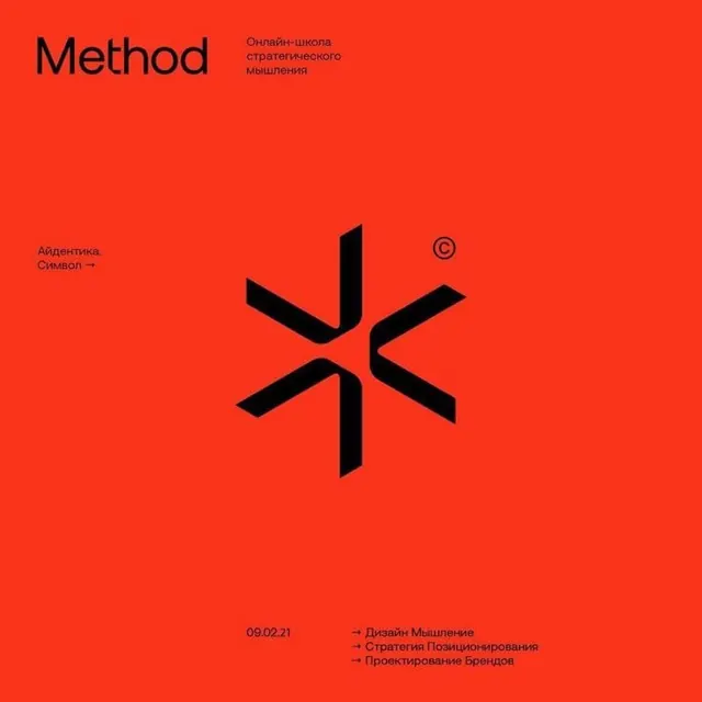
Identity layout for Method, a strategic-thinking school, built around a black six-fold asterisk mark centered on a vivid red field with Cyrillic captions at the corners.
Summary
A red-on-black identity layout for "Method", an online school of strategic thinking, organized around a black geometric symbol built from six interlocking arrow-like blades forming an asterisk. The single saturated red field carries the whole composition.
Visual description
The full background is a flat vivid red. Top-left sits the "Method" wordmark in a soft-cornered black sans-serif, with three lines of small Cyrillic subtitle to its right. The black asterisk mark, six rotational blades meeting at center, sits in the middle with a small superscript copyright symbol at upper-right. A left-margin caption ("Айдентика. Символ →") labels the mark. The bottom edge holds a date "09.02.21" beside a three-line arrow-led list of services in Cyrillic, all set small and tightly aligned.
Key takeaway
The rotational six-fold mark reads simultaneously as an asterisk, a snowflake, and an abstract "M", giving one symbol several legible interpretations. Pinning tiny labeled captions to the corners (with arrows and a date) frames the logo like an exhibit plate, a clean way to present a single mark with context.
Reuse notes
Strong template for a one-color brand presentation slide or identity case-study cover where a single symbol does the work. Pairs well with a neutral grotesque and high-saturation backgrounds. Caveat: the all-red field is intense, so it suits a confident, attention-seeking brand rather than a calm one.
More like this




Keep what you find
A free account saves references to boards and can send you a weekly email of picks based on what you save.
To see every result, go Pro.