Preview image. Unlock full-res
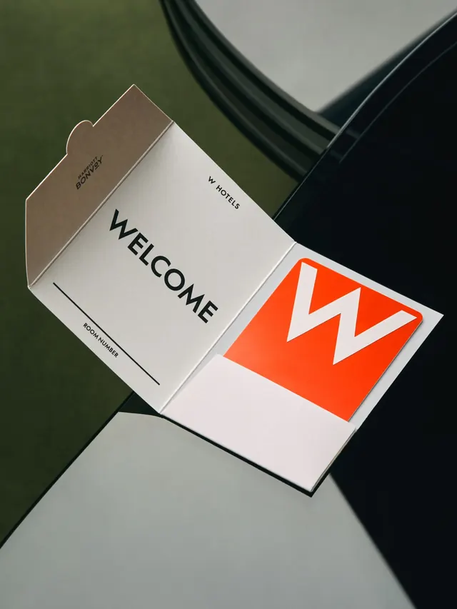
Hotel welcome card pairing a taupe paper stock with bold orange-red zigzag mark, deployed on die-cut envelope flap and matching interior card.
Summary
A hospitality welcome packet using negative space and a bold geometric zigzag to signal contemporary luxury within a restrained material palette.
Visual description
A folded welcome card shot diagonally against a dark green background. The taupe front panel bears the word "WELCOME" in bold sans-serif; the back flap is die-cut in an abstract cloud or wave shape and printed in a matte warm brown. The interior card reveals a bright orange-red background with a bold white zigzag symbol (resembling W Hotels' mark), crisp and high-contrast. Text labels for "DELIVERY" and "ROOM NUMBER" appear in small sans-serif caps. The composition emphasizes the interplay of the matte paper finish against a dark, reflective surface, showing how the die-cut flap adds dimensional interest to a simple stationery set.
Key takeaway
Die-cutting one element of a stationery suite creates memorable tactile interest without cluttering the design. The bright interior color surprise rewards opening the envelope. Pairing one bold geometric mark with minimal typography makes the mark itself the hero.
Reuse notes
Strong for hospitality, luxury goods, and any brand wanting to marry restrained exterior messaging with a confident interior reveal. Works best with print production that can support die-cutting and color blocking.
More like this





Keep what you find
A free account saves references to boards and can send you a weekly email of picks based on what you save.
To see every result, go Pro.