Preview image. Unlock full-res
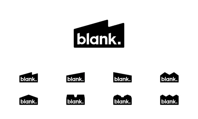
A wordmark and icon system for 'blank.' using a bold sans-serif word alongside a geometric, angled cut-paper shape motif, shown in primary and scaled variations on a monochromatic black-and-white palette.
Summary
A visual identity system for "blank." comprising a solid-weight sans-serif word mark paired with a geometric cut-paper icon (an angled polygonal shape), shown at various scales and proportions to demonstrate consistent mark application.
Visual description
The top of the image shows a primary large mark: the word "blank." set in bold, modern sans-serif (lowercase) with a trailing period, paired with a black geometric shape resembling a cut or folded paper form (angular, slightly 3D-looking due to notched edges). Below the primary mark are eight smaller variations arranged in two rows of four, each scaling the mark or the icon shape independently, all maintaining the same high-contrast black-on-white (and white-on-black) relationships. The geometric shape varies slightly (notched at the top, different angles on the sides) across sizes, showing how the icon adapts while preserving its angular, minimalist character. The entire system uses only black, white, and light gray, with no color or gradient. The composition is clean and grid-based, emphasizing the mark's versatility across applications.
Key takeaway
A paired wordmark and icon system allows flexible application: the word can stand alone, the icon can serve as a standalone mark (favicon, app icon), or both can lock together. Geometric icons built from simple angular shapes are scalable and memorable at any size. Showing proportional variations (icon at different scales relative to the wordmark) clarifies how the mark adapts without distortion or loss of legibility, which is crucial for design systems documentation.
Reuse notes
Strong for tech, software, and corporate branding where minimalist modernism signals clarity and functionality. The monochromatic approach is economical for single-color applications (embroidery, signage, low-budget print) and adapts easily to color overlays later. The sans-serif typeface is neutral and current, but will feel less distinctive if the icon variant is removed; keep the geometric shape as the brand's anchor. Works well across all digital and physical media. The angled geometry reads as "sharp" or "cutting-edge"; avoid if the brand message is softer or organic.