Preview image. Unlock full-res
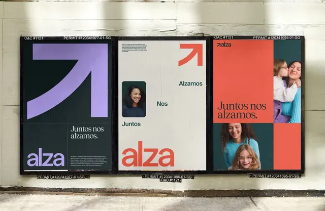
A bold geometric identity with striking color blocks, curved brand mark, and portrait photography communicating social connection and support.
Summary
A bold geometric identity with striking color blocks, curved brand mark, and portrait photography communicating social connection and support.
Visual description
Three large-format posters mounted on an exterior wall display a cohesive identity system. The left panel shows a purple curved arrow form on a dark navy background with the brand name in contrasting purple type and supporting copy. The center panel uses a neutral beige ground with small portrait photography, descriptive text in teal type, and a large coral-red sans-serif nameplate. The right panel features a bold coral-red headline over a split composition of teal and coral sections containing group portraits of diverse faces. The brand palette alternates between warm neutrals, coral red, purple, deep navy, and teal, creating dynamic visual contrast while maintaining refined proportions and sophisticated color relationships.
Key takeaway
The use of human photography as a primary brand asset, placed with clear compositional structure rather than as background. The restrained application of a three-to-four color palette across stark geometric blocks creates motion and energy without clutter. The curved geometric form as the core mark, working equally well large and reduced.
Reuse notes
Ideal for organizations in social impact, nonprofit, or inclusive-community verticals where the human element and emotional connection are central to the mission. The scale of the typography and photography reads convincingly in large-format applications. The color intensity requires careful application in digital contexts to maintain balance; consider darkening backgrounds on screens.
More like this






Keep what you find
A free account saves references to boards and can send you a weekly email of picks based on what you save.
To see every result, go Pro.