Preview image. Unlock full-res
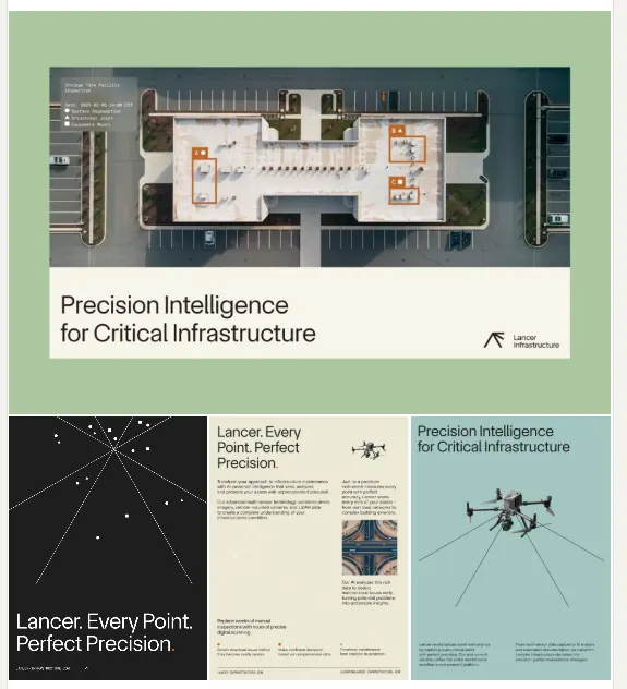
A technical identity system for security infrastructure combining architectural floor plans, network diagrams, and serif type on a neutral and sage-green palette.
Summary
A technical identity system for security infrastructure combining architectural floor plans, network diagrams, and serif type on a neutral and sage-green palette.
Visual description
Three presentation mockups displayed on cream-colored wall panels show a cohesive branding system. The left panel features a geometric mark in sage green and dark navy against a bold color split, paired with the company name in serif type. The middle panel presents a floor plan architectural diagram of an interior space, accompanied by body copy and centered type treatment. The right panel shows a network topology diagram with radiating nodes in teal against light cream, illustrating system infrastructure. The palette consistently pairs muted sage greens and teal accents with warm off-white, dark navy, and cool grays, creating a professional, analytical aesthetic.
Key takeaway
The strategic use of functional diagrams (architectural plans, network topologies) as core brand assets rather than decoration. The restraint in the color palette, anchoring professional credibility through muted earth tones and single accent colors. The contrast between serif headline type and sans-serif body copy for hierarchy and clarity on minimalist layouts.
Reuse notes
Strong reference for security-focused B2B brands, infrastructure companies, and any organization that needs to convey precision and reliability. The architectural and network diagram approach works when the brand's actual product or service involves systems, spaces, or connectivity. Avoids the over-explanation trap while remaining highly informative.
More like this





Keep what you find
A free account saves references to boards and can send you a weekly email of picks based on what you save.
To see every result, go Pro.