Preview image. Unlock full-res
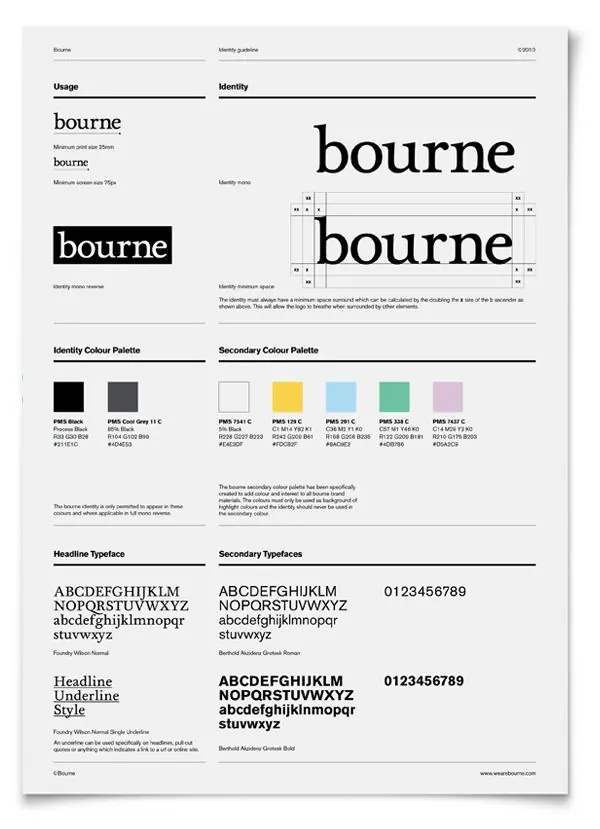
Corporate identity guideline for Bourne brand showing typographic hierarchy, color palette, and logo usage rules in a modular grid system.
Summary
Brand identity guideline for Bourne showcasing logo variations, strict usage rules, monochromatic palette, and typographic specifications across a structured grid layout.
Visual description
A multi-panel brand guideline document laid out on a light gray background. The "bourne" logotype appears in three variations: large serif display, bold black lockup, and outlined versions, with spacing and sizing rules annotated. Two distinct color palettes are presented below: a primary dark monochromatic set (PMS Black, Cool Gray 11) and a secondary palette of six accent colors including yellow, light blue, mint green, and soft pink, each labeled with PMS and RGB values. Typography sections show headline and secondary typefaces (Foundry Wilson Normal and Bedroll Academy Grotesk) in various weights and styles, with body copy demonstrating application.
Key takeaway
The systematic structure: one page efficiently communicates logo rules, color constraints (primary vs. secondary use), and type hierarchy through labeled examples and spec callouts. The monochromatic core with accent options allows brand flexibility without confusion.
Reuse notes
Reference for building corporate identity systems that need to communicate strict usage rules at a glance. The two-palette approach (primary neutral + secondary accents) is a pragmatic model for consistency across diverse applications.
More like this
Keep what you find
A free account saves references to boards and can send you a weekly email of picks based on what you save.
To see every result, go Pro.