Preview image. Unlock full-res
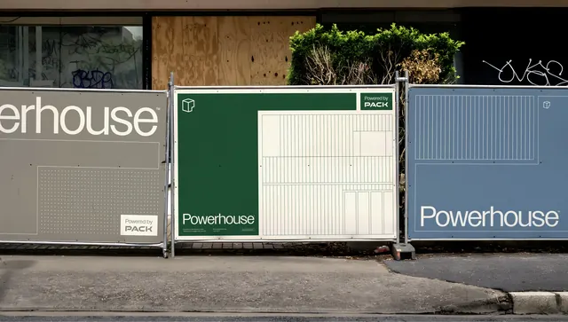
Powerhouse brand identity applied across concrete security gates with a palette of forest green, slate blue, and cream, using rectilinear paneling and sans-serif wordmarks to suggest structural stability and security.
Summary
Powerhouse brand identity applied across concrete security gates with a palette of forest green, slate blue, and cream, using rectilinear paneling and sans-serif wordmarks to suggest structural stability and security.
Visual description
Three concrete security gates display variants of the Powerhouse identity. The leftmost panel shows "erhouse" wordmark in white sans-serif on gray, with a faint geometric grid underlay. The center and right panels use deep forest green and slate blue backgrounds respectively, each with the full "Powerhouse" name in white sans-serif positioned vertically or horizontally within a white rectangular frame. The green panel includes a small "PACK" sub-mark above the wordmark. All panels use the same modular grid language (visible as fine vertical striping) and are separated by aluminum frame elements. Living plants appear above, grounding the industrial aesthetic in a slightly organic context.
Key takeaway
The modular, rectilinear treatment of a wordmark across different colored panels creates visual harmony while allowing flexibility in application. The grid-based system (visible as striping) is subtle but gives the whole identity a sense of structural order and engineering precision. Using complementary cool tones (forest green and slate blue against white) conveys security and professionalism without coldness.
Reuse notes
Ideal for security, infrastructure, or industrial B2B brands where modularity and structural clarity matter. The system scales well across signage and environmental applications. Pair with sans-serif type for maximum legibility at distance.
More like this






Keep what you find
A free account saves references to boards and can send you a weekly email of picks based on what you save.
To see every result, go Pro.