Preview image. Unlock full-res
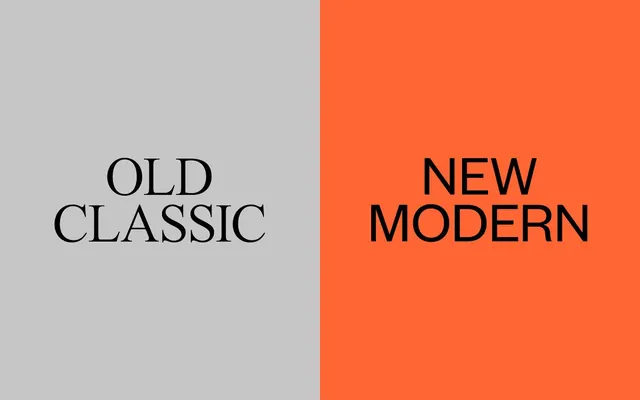
Vertical split-screen type specimen contrasting serif typeface (left, neutral gray) against sans-serif (right, vibrant orange), demonstrating two design eras side-by-side.
Summary
A vertical split-screen type specimen juxtaposing serif and sans-serif typefaces to illustrate the visual difference between traditional and contemporary typography.
Visual description
A perfectly halved rectangular composition: the left half features a neutral gray background with "OLD CLASSIC" rendered in a traditional serif typeface in black, while the right half is a saturated warm orange with "NEW MODERN" in a geometric sans-serif also in black. The vertical center line creates a hard edge between the two halves. Both typefaces are sized identically and occupy the same vertical space, allowing direct formal comparison of serif curves versus sans letterforms.
Key takeaway
The stark visual contrast created by a 50/50 split, with color and typeface as the only differentiators. The composition is self-explanatory without labels or explanation. The bright orange jump makes the right side dominance read as "forward-facing," reinforcing the new/modern narrative.
Reuse notes
Strong format for showcasing before-and-after rebrandings, typeface pairings, or design system transitions. The high-contrast color helps each side read independently; works well in marketing decks or identity guidelines where side-by-side comparison is the goal. The bold orange may be too demanding for subtle transitions; dial down saturation if the goal is harmony rather than disruption.
More like this




Keep what you find
A free account saves references to boards and can send you a weekly email of picks based on what you save.
To see every result, go Pro.