Preview image. Unlock full-res
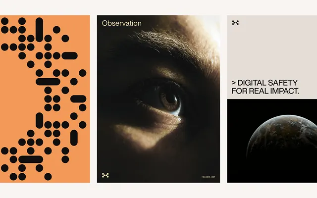
A high-contrast editorial composition layering abstract orange dots, toned photography, and geometric elements to communicate digital safety messaging with visual weight and seriousness.
Summary
A high-contrast editorial composition layering abstract orange dots, toned photography, and geometric elements to communicate digital safety messaging with visual weight and seriousness.
Visual description
The composition divides into three vertical sections: on the left, an abstract field of orange and black circles arranged in a loose pattern against cream background; in the center, a high-contrast toned photograph of a human face shown in profile with a label reading "Observation"; on the right, a dark background featuring a small photographic detail and white text reading "DIGITAL SAFETY FOR REAL IMPACT." The layout uses stark black bars and white type to anchor the editorial hierarchy. Cream dominates the background with black and orange providing intense contrast. The overall tone is serious and deliberate, suggesting institutional or security-focused content.
Key takeaway
The abstraction-to-concrete visual progression (geometric pattern to close-up photography) creates intellectual and emotional depth simultaneously. The minimal copy combined with evocative imagery lets the design carry the message without overexplaining. The three-section division feels both editorial and structured, working well for posters and print campaigns.
Reuse notes
Effective for security, privacy, or safety-focused communications where tone needs to be serious and trustworthy. Works as a poster, report cover, or social advertisement. The high contrast ensures impact at small sizes and from a distance. Best paired with concise, authoritative copy.
More like this







Keep what you find
A free account saves references to boards and can send you a weekly email of picks based on what you save.
To see every result, go Pro.