Preview image. Unlock full-res
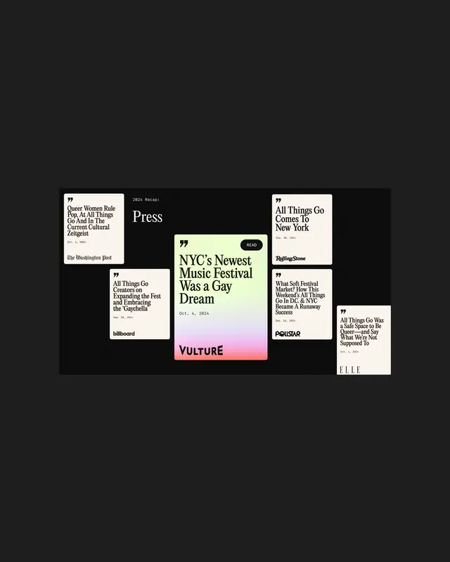
High-contrast black and off-white grid layout featuring stacked magazine covers and press excerpts showcasing typography-forward editorial design for music and culture journalism.
Summary
Editorial design system for music journalism layering cream-colored magazine covers and press cards in an asymmetric grid against solid black, showcasing feature headlines in bold display type.
Visual description
A dark background hosts a loose arrangement of overlapping print pieces: several cream or off-white rectangular cards/covers featuring bold sans-serif and serif headlines (including music festival and culture publication mastheads like "Vulture", "Billboard", "Interview"), small body text, and editorial imagery callouts. Overlapping placement creates depth and visual interest. One card in the lower center has a soft pink or mauve accent panel. The typography ranges from all-caps sans-serif headlines to serif drop quotes and small sans-serif body text. The overall visual rhythm balances tight, dense text areas with spacious negative areas within each card. High contrast between the jet-black background and cream foreground creates visual punch. The layout feels like a loose mood-board or press-kit layout.
Key takeaway
The modular card system: each publication or article snippet lives in its own defined rectangular space with consistent padding and margins, allowing the full grid to feel organized despite loose positioning. The use of a solid dark background to unify disparate editorial pieces creates a gallery-like presentation. The typographic variety (mixing serif and sans-serif display faces) remains cohesive because of consistent sizing ratios and color discipline. The subtle accent color (pink) on one element provides hierarchy and focus without overwhelming.
Reuse notes
Strong template for media kit, press pack, or editorial portfolio layouts. Works especially well for music, culture, or lifestyle publications that need to showcase multiple editorial voices or outlets simultaneously. The black background is best for digital presentations or high-gloss print; adapt the background for traditional offset printing. The cream-on-black palette is trendy but timeless for editorial; can shift the accent color to match brand guidelines without changing the system's clarity.
More like this




Keep what you find
A free account saves references to boards and can send you a weekly email of picks based on what you save.
To see every result, go Pro.