Preview image. Unlock full-res
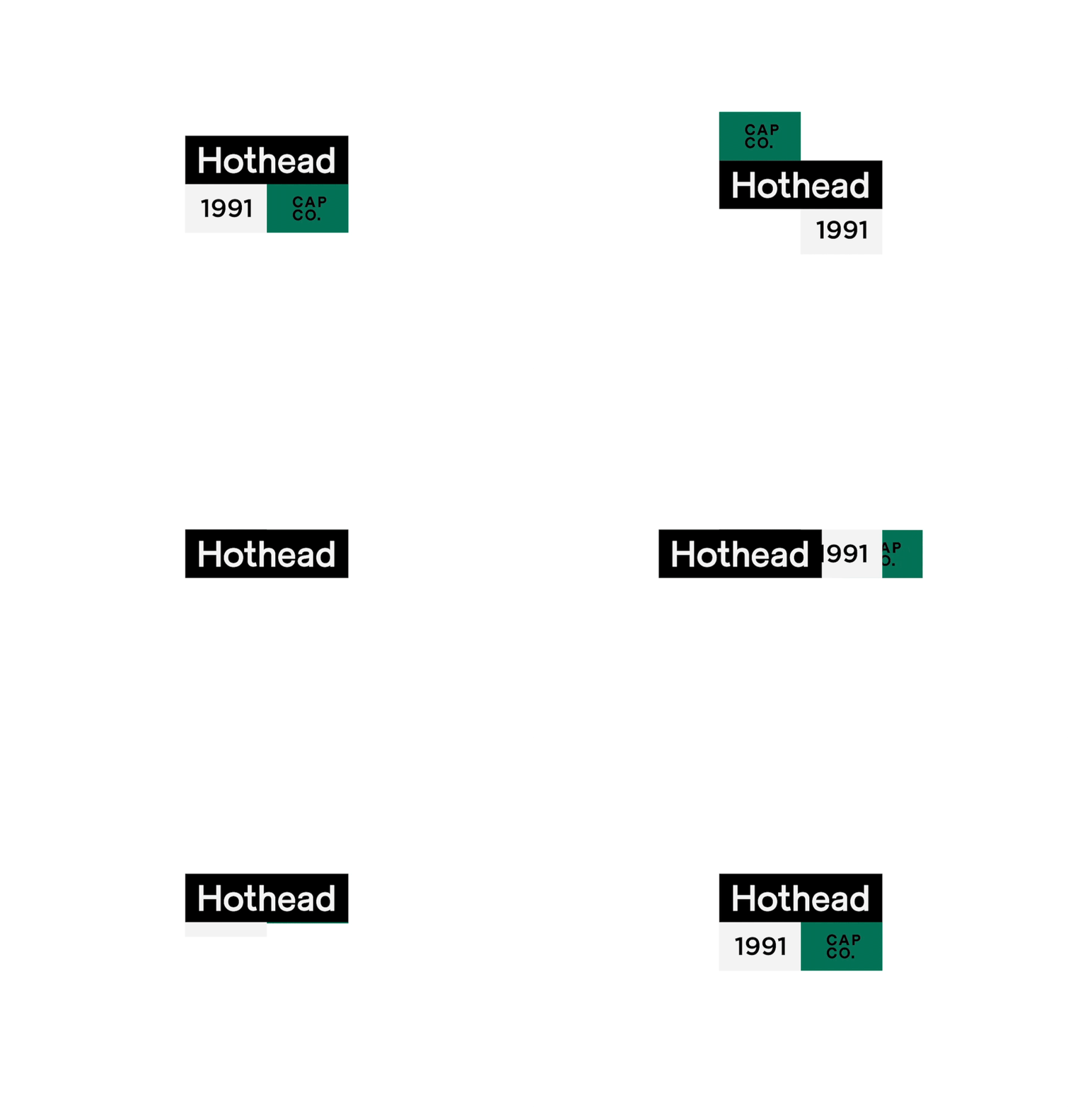
A modular logo system for Hothead 1991 Cap Co. using three stacked color blocks: solid black with white logotype, light gray with serif numerals, and deep teal with lowercase letterforms.
Summary
A modular logo system for Hothead 1991 Cap Co. stacking three color blocks as a visual hierarchy: black letterhead block with white sans-serif logotype, light gray middle block with serif "1991" numerals, and deep teal lower block with "CAP CO." in black.
Visual description
Three stacked rectangular blocks form the complete identity: a black panel spanning the full width with "Hothead" in clean, modern white sans-serif (approximately 40-50% text weight); a light gray panel below-left containing "1991" in a refined serif typeface (roughly one-quarter width); and a deep forest-teal panel below-right with "CAP CO." set in black lowercase sans-serif. Sharp edges align vertically with no overlaps; the white background isolates each element. The color contrast between black/white and the cool teal creates visual rhythm and semantic grouping (wordmark / year / company type).
Key takeaway
A modular, stacked logo system that separates brand identity layers (name, founding year, category) into distinct color-blocked zones. The teal accent grounds the visual identity while black/white neutrals ensure reproduction fidelity across media. The geometry is grid-friendly and works equally well at small (mark-only) and large (stacked full system) scales.
Reuse notes
Effective for apparel, retail, or heritage brands emphasizing structured minimalism and historical specificity. Works well on hangtags, packaging, storefronts, and embroidery where modular lockups are needed. The 1991 date suggests this is a vintage rebrand or historical reference; ensure any adoption respects the period authenticity. The teal reads sophisticated rather than trendy, aging better than neon accents.
More like this





Keep what you find
A free account saves references to boards and can send you a weekly email of picks based on what you save.
To see every result, go Pro.