Preview image. Unlock full-res
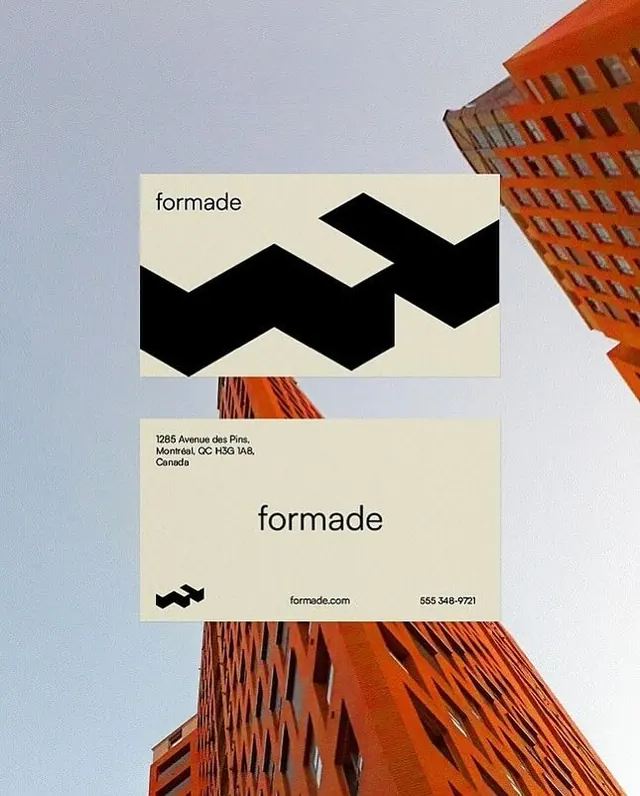
Construction company identity with a geometric chevron mark anchored by cream and black contact cards showing Montreal address and web presence.
Summary
A construction company identity using a sharp black chevron as the primary mark, presented on cream business cards with clean sans-serif wordmark and contact details against brick building photography.
Visual description
Two stacked cream-colored business cards with a geometric black chevron logo positioned above the wordmark "formade" in a minimal sans-serif typeface. The lower card shows the company name and contact information: street address (Montreal), postal code (H3G 1A8), and website/phone in the bottom right. A decorative brick building exterior photographed in warm orange-red tones frames the composition at top and bottom, grounding the palette. The layout is left-aligned on the cards with deliberate negative space.
Key takeaway
The chevron as a graphic anchor that works at multiple scales. The pairing of cream and black for sophisticated high contrast. The strategic use of the building photography as contextual framing rather than background, keeping the cards themselves clean and readable.
Reuse notes
Strong model for architecture, construction, real estate, or B2B service companies that benefit from geometric mark-making and tactile material presentation. Works because the photograph contextualizes the industry without cluttering the card design itself.
More like this





Keep what you find
A free account saves references to boards and can send you a weekly email of picks based on what you save.
To see every result, go Pro.