Preview image. Unlock full-res
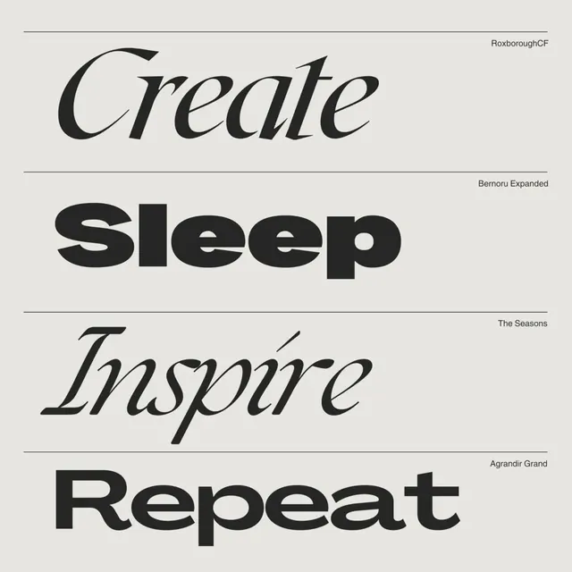
Four stacked words in contrasting serif and sans-serif typefaces, separated by horizontal rules, demonstrating a modular typographic hierarchy.
Summary
Four conceptual words stacked vertically with deliberate serif-and-sans mixing, separated by horizontal rules on a light ground, creating a verbal identity system.
Visual description
The layout is a strict vertical stack of four typographic lines: "Create" in a dramatic serif italic (RoxboroughCF), "Sleep" in a heavy geometric sans-serif (Bernoru Expanded), "Inspire" in a flowing serif italic (The Seasons), and "Repeat" in a bold geometric sans (Agrandir Grand). Horizontal lines bracket the top and bottom edges. Thin horizontal rules sit above and below the "Sleep" section, creating discrete visual units. The typeface credits appear in small sans-serif at the right margin. Black type on cream ground throughout. The proportional spacing between blocks gives each word equal visual weight despite their different weights and proportions.
Key takeaway
Pairing serif and sans-serif typefaces within a single identity to signal sophistication and multiplicity; using horizontal rules as structural dividers rather than decoration, forcing the eye to pause at each level; the restraint of limiting to two or three typefaces while rotating weights and styles to suggest energy and intentionality.
Reuse notes
Strong for lifestyle, creative, or wellness brands that need to communicate process or cyclicity. The serif-and-sans contrast works especially well when paired with a consistent grid or rational spacing rule. The vertical stack suits narrow layouts, Instagram posts, or bookmarks. Less suitable for icon-heavy or emoji-driven brands.
More like this





Keep what you find
A free account saves references to boards and can send you a weekly email of picks based on what you save.
To see every result, go Pro.