Preview image. Unlock full-res
Monochrome interlocking geometric mark reading as a stylized face or ribbon knot, with Garmon wordmark in serif below.
Summary
A monoline interlocking mark composed of four curved ribbon loops forming a knot or stylized face, rendered in white on a grainy black square, with "GARMON" in serif type below.
Visual description
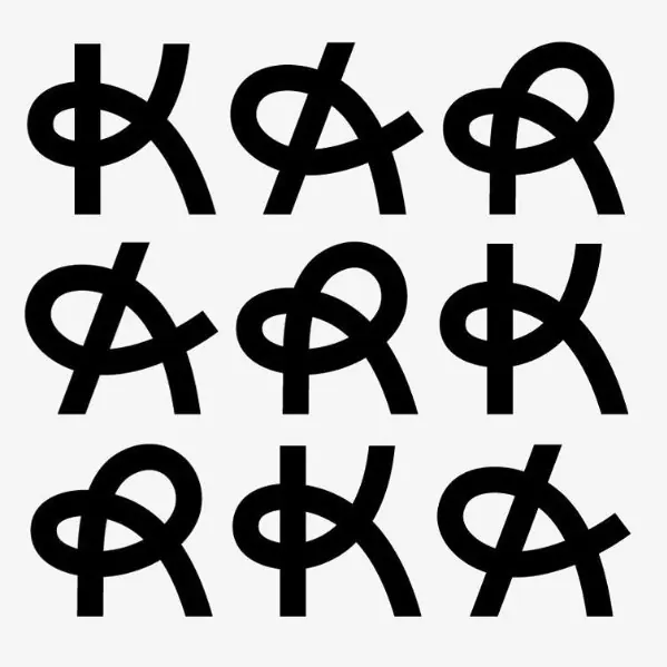
A centered square black field with a grainy, aged texture contains a white monoline logo: four curved strokes weaving over and under each other in a symmetric pattern, suggesting both a ribbon knot and a stylized human face with open eyes. The strokes are even-width, cleanly executed, and create negative space in the center. Below the mark sits the wordmark "GARMON" in a classical serif typeface, uppercase, centered, in black on the off-white surrounding page. The overall composition is mounted on an off-white board, suggesting a printed specimen or portfolio piece.
Key takeaway
The monoline interlocking ribbon technique—deceptively simple, infinitely recognizable once learned. The wordmark's serif type choice grounds what could feel frivolous as heraldic and professional. The grainy texture on the black square adds warmth and printability without diluting the graphic.
Reuse notes
Strong for heritage brands, luxury goods, professional services, or anyone wanting a "designed not defaulted" mark. The interlocking motif suggests interconnection and unity. High monochrome contrast ensures legibility in single-color applications. Print-first sensibility (the grainy square, the typography) suits letterheads, seals, packaging labels. Not suitable for small icon scales or web-first brands without refinement.