Preview image. Unlock full-res
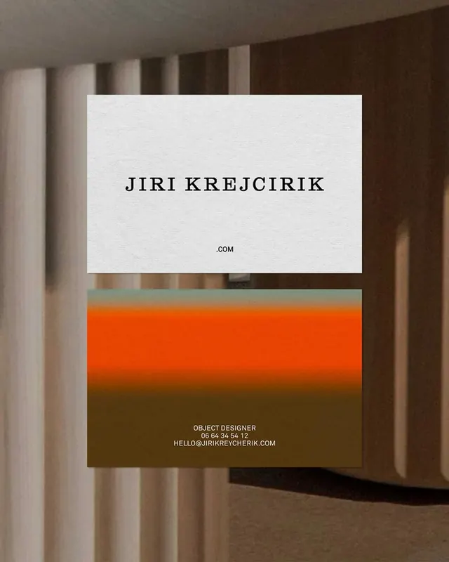
A portfolio business card pairing cream paper with a bold orange-to-olive gradient band and serif wordmark.
Summary
A portfolio business card dividing cream paper between a clean serif wordmark above and a bold orange-to-brown gradient band anchoring contact details below.
Visual description
Two-card composition: the upper card features centered black serif type (JIRI KRAJCIRIK) on cream stock with small .COM domain suffix. The lower card is the reverse, dominated by a horizontal gradient transitioning from bright orange at top through warm rust to deep olive brown at bottom. White sans-serif contact info (OBJECT DESIGNER, phone, email) sits on the warm brown lower portion. A thin dark line separates the two cards. Shot against a warm architectural backdrop with vertical striations and soft shadows.
Key takeaway
The stark contrast strategy: a near-monochromatic cream half lets the serif wordmark breathe, while a single bold gradient on the reverse anchors contact info with color. The gradient's temperature shift (orange to olive) unifies the palette without complexity. This card design flips convention by treating the back as the primary visual statement.
Reuse notes
Works for design portfolios, creative agencies, and luxury services where the back of the card is equally important as the front. The serif-gradient pairing reads contemporary but slightly retro. Best with substantial paper stock where the two-sided reveal matters. Avoid if contact info needs emphasis on the front.
More like this





Keep what you find
A free account saves references to boards and can send you a weekly email of picks based on what you save.
To see every result, go Pro.