Preview image. Unlock full-res
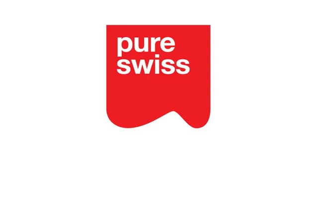
Bold two-line wordmark 'pure swiss' in white sans-serif centered within a bright red rounded-rectangle badge on white background.
Summary
Bold two-line wordmark 'pure swiss' in white sans-serif centered within a bright red rounded-rectangle badge on white background.
Visual description
Uppercase sans-serif type stacked across two lines, rendered in pure white against a solid bright red (#EE1D23) geometric shape. The badge form is a rounded rectangle, wider than it is tall, with smooth curved bottom corners. Word spacing and baseline alignment create visual rhythm. White background provides breathing room and emphasizes the geometric container. The typeface appears to be a geometric sans-serif with clean, uniform stroke weight and open counters, similar to Helvetica or Swiss-style type families. The red-to-white ratio and shape proportions follow classic badge/seal conventions.
Key takeaway
The geometric badge as a graphic container elevates simple type. Bright pure red against white generates maximum contrast and legibility, making the wordmark iconic and instantly recognizable. The rounded-rectangle form is simpler than a circle but retains friendliness, working well for food and wellness brands seeking confidence without aggression.
Reuse notes
Effective for brands in food, beverage, or health sectors where clear, direct messaging matters. The geometric badge functions as both wordmark and seal, useful in contexts requiring both lockups and standalone marks. Scalable across sizes, though the boldness reads best when the form remains prominent.
More like this



Keep what you find
A free account saves references to boards and can send you a weekly email of picks based on what you save.
To see every result, go Pro.