Preview image. Unlock full-res
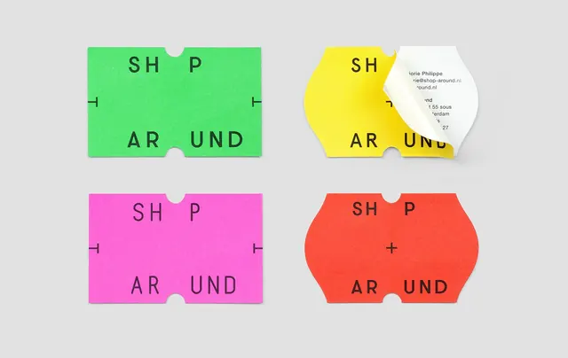
Bold sans-serif wordmark 'Shop Around' rendered in four bright, saturated hues (green, yellow, magenta, red) within custom ticket-shaped forms on a neutral background.
Summary
A four-color typeface specimen showcasing the same bold all-caps wordmark 'Shop Around' in lime green, bright yellow, magenta, and coral-red, each rendered in a rounded ticket-shaped container with die-cut details.
Visual description
Four identical custom-shaped card containers arranged in a 2x2 grid on a light gray background. Each container has a rectangular body with rounded corners and a white circular die-cut near the top center, creating a ticket stub or punch-card aesthetic. The cards are filled with solid, high-saturation color: lime green (top left), bright yellow (top right), hot magenta (bottom left), and coral-red (bottom right). Within each shape, the words 'Shop Around' are rendered in a modern, geometric sans-serif typeface, uppercase, in dark teal or black letterforms. The typography is bold and confident, designed for maximum legibility against the saturated backgrounds. Minimal additional detail; focus is entirely on color variation and typography.
Key takeaway
Color blocking with geometric shapes creates visual rhythm and brand variety without changing form. The die-cut ticket detail signals playfulness and suggests multiple applications (labels, price tags, promotional stickers). High-saturation primary and secondary hues feel optimistic and retail-friendly. The consistent typography across color changes demonstrates typeface versatility.
Reuse notes
Ideal for retail, fashion, food, or lifestyle brands seeking a playful, energetic identity. The ticket-shape format translates well to packaging, labels, and point-of-sale materials. Works especially well for youth-oriented or trendy brands. The saturated palette demands careful use in digital contexts (may cause eye strain); print and physical applications are ideal.
More like this







Keep what you find
A free account saves references to boards and can send you a weekly email of picks based on what you save.
To see every result, go Pro.