Preview image. Unlock full-res
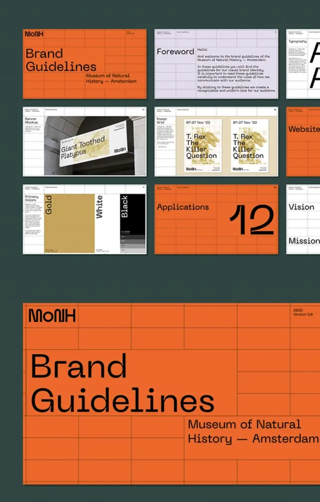
Museum of Natural History brand guidelines presented as a structured grid system with burnt orange modules, dark teal background, and clear typographic hierarchy.
Summary
Museum of Natural History brand guidelines presented as a structured grid system with burnt orange modules, dark teal background, and clear typographic hierarchy.
Visual description
The composition shows a multi-page brand guidelines spread arranged in a grid collage. The dominant color palette pairs burnt orange rectangular modules (containing headline typography and content blocks) with a dark teal-green background. Smaller white and gray cards display typography specimens, photographs of signage/applications, and text-heavy guideline pages. The layout uses consistent rectangular divisions and generous spacing, with section headers in large bold sans-serif type. The Museum of Natural History name and subtitle appear prominently, with supporting pages showing logo usage, color palettes, and wayfinding applications.
Key takeaway
The modular card approach to presenting brand systems: each application (typography, logo, signage, poster) gets its own framed rectangle within the larger grid, making the system scannable and memorable. The orange-on-teal complementary palette creates clear visual separation between active content and supporting material without requiring photographs or complex imagery.
Reuse notes
Ideal for cultural institutions, nonprofits, and educational organizations where authority and clarity matter equally. The structured grid system works well for both printed books and digital PDFs. The color strategy is especially effective for museums and heritage brands because it balances approachability (orange warmth) with credibility (deep teal institutional feel).
More like this







Keep what you find
A free account saves references to boards and can send you a weekly email of picks based on what you save.
To see every result, go Pro.