Preview image. Unlock full-res
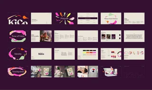
Food brand identity for KiCo combining fluid gradient mark, clean typography, and modular sections (Purpose, Tone of Voice, Personality, Identity, Food pairing) on a deep purple background.
Summary
Complete brand identity grid for KiCo, a food company, layering a flowing gradient logo mark against warm naturals and illustrating brand voice, personality dimensions, and lifestyle photography applications on a deep purple field.
Visual description
Six rows of branded content on a deep plum background. Top row shows the fluid gradient mark (pink, magenta, orange, chartreuse curves), a welcome booklet spread, abstract multicolored brushstrokes labeled "Purpose," a dry palette and color key, a gradient mark lockup with organic shapes labeled "Where Food Thrives," and a statement page. Middle rows show sections for Tone of Voice (flowing mark with soft curves), Personality (mood photography of pottery and food), voice principles, color and illustration systems (bright overlays on food images), and Food Pairings photography. Bottom row displays touchpoints: in-store signage, branded packaging, product photography, collateral, and responsive digital applications. Throughout, sans-serif typography pairs with hand-drawn organic forms, food photography, and a warm analogous palette of deep plum, cream, mauve, and warm pinks.
Key takeaway
Organic mark language (flowing gradient ribbons) as the anchor visual that ties a rigid grid of system elements together. Using food photography as personality expression, not decoration. Alternating principle text and image-heavy sections to show voice in action across platforms.
Reuse notes
Strong for luxury food, hospitality, or wellness brands that need warmth without saccharine feel. The gradient mark simplifies well at icon scale. Works best with generous white space and high-quality lifestyle photography.