Preview image. Unlock full-res
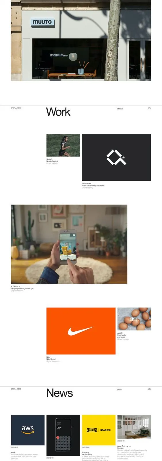
Multi-page brand guidelines presenting Work Sans typography, modular grid systems, photography, and icon treatment across commercial and editorial applications.
Summary
A comprehensive brand guidelines document for Forming Essentials, demonstrating typography, grid-based layouts, brand photography, and icon systems in a cohesive editorial framework.
Visual description
A scrolling sequence of brand pages including a "Forming Essentials" title page with supporting text, a dedicated "Work Sans" typography section listing the full character set, portfolio spreads showing real-world applications (storefronts, app screens, product photography), a "News" section with client logos and featured work in a grid layout, and a detailed pattern system at the bottom made of thin vertical lines in varying densities. Pages use generous white space, flush-left alignment, and sans-serif headlines throughout. Color is restrained to black, warm grays, and occasional bright orange accents against predominantly white backgrounds.
Key takeaway
The modular grid approach allows the same system to accommodate typography specs, photography, logos, and abstract patterns without feeling disjointed. The consistent use of white space as a compositional element makes dense information readable. The pattern section at the bottom demonstrates how a secondary graphic system can extend the brand without requiring additional color.
Reuse notes
Ideal template for design-forward or technology brands needing to communicate professional credibility while maintaining visual warmth through careful gray-toning and white space. The editorial treatment works well for brands that want to position themselves as thoughtful and refined rather than playful. The portfolio examples anchor the guidelines in real application, which is useful for internal and external stakeholder buy-in.
More like this





Keep what you find
A free account saves references to boards and can send you a weekly email of picks based on what you save.
To see every result, go Pro.