Preview image. Unlock full-res
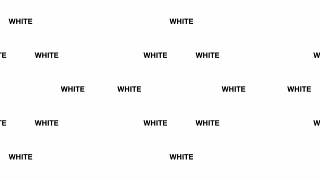
The word WHITE repeated at varying sizes and positions across a white background, exploring typographic texture and negative space through systematic repetition.
Summary
The single word WHITE is repeated at irregular sizes and positions across a white background, creating visual texture through monochromatic typography and systematic variation in scale and placement.
Visual description
Dark gray or black sans-serif type spelling "WHITE" appears nine to ten times across an almost entirely white background, arranged in a loose asymmetric grid. The word sizes vary noticeably, with some instances larger and others condensed or positioned at the edges. The composition relies on negative space and the contrast between the dark type and the nearly-white background. The letterforms are clean and geometric, suggesting a condensed or standard sans-serif typeface. The overall effect is stark and minimal, with the repetition creating rhythm without becoming predictable.
Key takeaway
Using repetition and scale variation to create visual interest within monochromatic, minimalist constraints. The deliberate lack of symmetry makes the composition feel intentional rather than accidental. The interplay between positive type and generous negative space creates a sense of calm and sophistication despite the repetitive element.
Reuse notes
Effective as a type-system showcase or conceptual identity exploration. Works well for design studios, publishing, or editorial contexts seeking an intellectual, refined aesthetic. The monochromatic approach is versatile and scales across applications. The sparse, controlled composition can feel cold if applied to warm or human-focused brands.
More like this





Keep what you find
A free account saves references to boards and can send you a weekly email of picks based on what you save.
To see every result, go Pro.