Preview image. Unlock full-res
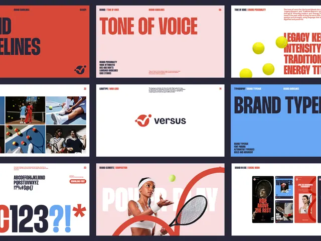
Multi-panel brand guide showing tone of voice, typographic hierarchy, and color-blocking treatment across nine distinct layout variations.
Summary
A nine-panel brand system template showing tone of voice, typographic hierarchy, color palettes, and layout patterns unified by bold all-caps sans-serif, bright red and blue accents, and high-contrast layouts.
Visual description
A 3x3 grid of brand-identity layouts. Top row: red panel with large "TONE OF VOICE" text; pale pink panel with "TONE OF VOICE" and smaller copy; white panel with yellow circular elements and red text. Middle row: grid of lifestyle photos in cool blues; centered "versus" wordmark on white; blue panel with "BRAND TYPES" in dark sans-serif. Bottom row: red and white panel with numeric shapes and punctuation marks; pale pink panel with woman holding tennis racket, yellow spheres, red curved graphic; dark panel with printed material mockups. All panels use consistent color palette of red, blue, yellow, pink, white, and dark navy. Typography is assertive and geometric. No photography except lifestyle shots in two panels.
Key takeaway
The modular 3x3 grid system itself, allowing brands to present multiple identity applications at once. The color-blocking discipline, letting two to three brights anchor each panel without clutter. The repetition of "TONE OF VOICE" and "BRAND" language signals the guide's purpose without explanation.
Reuse notes
Perfect template for a sports or energetic marketing brand building out a digital-first identity system. Works well when the brand leans bold and high-contrast. Not suitable for minimal or premium luxury brands, which would need quieter color palettes and more spacing.
More like this



Keep what you find
A free account saves references to boards and can send you a weekly email of picks based on what you save.
To see every result, go Pro.