Preview image. Unlock full-res
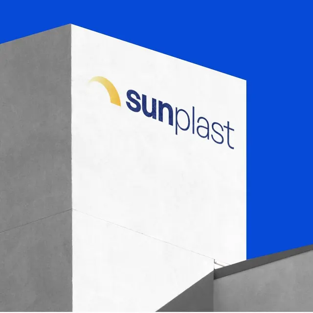
A bright yellow arc-mark logo paired with clean sans-serif wordmark, displayed on a white paper or box surface tilted against a cobalt blue sky and gray concrete forms.
Summary
The Sunplast logo, featuring a bright yellow arc and navy sans-serif wordmark, shown on a white product box or packaging mockup angled against deep blue sky and gray geometric concrete forms.
Visual description
A white rectangular box or package face is positioned at a three-quarter angle, with the Sunplast identity displayed dead-center: a yellow crescent or arc mark curves above the wordmark "sunplast" set in a clean, modern sans-serif typeface. The logotype sits on a clean white field with ample padding. Behind and above the box, the sky is a saturated cobalt blue; below and to the left, gray concrete planes and shadows suggest an architectural or industrial setting. The lighting is bright and even, emphasizing the geometric volumes and color contrast between the yellow mark, white surface, and blue backdrop.
Key takeaway
The color blocking: yellow against white and deep blue creates an immediate, trustworthy focal point that reads as energetic without being playful. A simple arc paired with lowercase sans-serif is modern and approachable. The 3D mockup staging in an outdoor architectural setting (rather than a studio white void) adds environmental credibility and suggests industrial or manufacturing confidence.
Reuse notes
Effective for B2B manufacturing, packaging, or industrial brands that need to convey both precision and approachability. The yellow-blue combination is versatile across sectors (food, chemicals, machinery). Works well at small scale and scales cleanly to large applications (vehicles, buildings, signage). The geometric staging itself can be replicated for other product packaging presentations.