Preview image. Unlock full-res
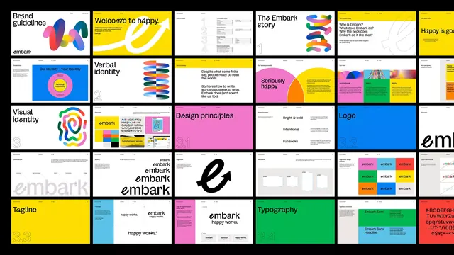
A comprehensive multi-panel identity grid showing brand applications across logo, typography, color blocks, and layout systems in yellow, blue, magenta, and teal on white and colored grounds.
Summary
A multi-page identity system grid for Embark showing coordinated applications of a geometric logo, color palette, and sans-serif typography across various brand documents and templates.
Visual description
A dense, organized grid of approximately 16-20 rectangular panels, each showcasing a different aspect of the Embark brand system. The grid opens with the "Brand guidelines" title in the top-left corner. Key panels include: a primary geometric logo (multicolor radial mark) set on white and colored backgrounds, typography samples labeled "Verbal identity" with stacked sans-serif lines, bold solid color blocks in yellow, blue, magenta, pink, and teal, layout templates with text block arrangements, a large wordmark "embark" in black serif italic, tagline examples, and an "Embark" logo specimen rendered at various scales. The entire grid is set against a black background, making the white and bright color panels pop. The visual system emphasizes modularity, with each panel a complete thumbnail showing how the brand components work both in isolation and in context.
Key takeaway
The strategy of showing a brand system as a dense grid of actual applications rather than abstract swatches alone. The use of high-contrast color combinations (yellow/blue, magenta/teal) that maintain vibrancy without overwhelming. The inclusion of context (what the brand looks like on business cards, signage, layouts) alongside the raw design elements.
Reuse notes
Ideal for tech or marketing brands seeking a modern, energetic identity with geometric logic. The yellow-blue core reads as friendly and trustworthy. The system is information-dense, so best presented at medium scale or larger where the thumbnails remain legible. Works well for brands in fast-moving verticals.
More like this


Keep what you find
A free account saves references to boards and can send you a weekly email of picks based on what you save.
To see every result, go Pro.