Preview image. Unlock full-res
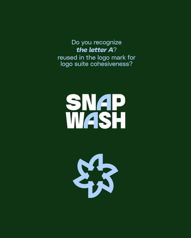
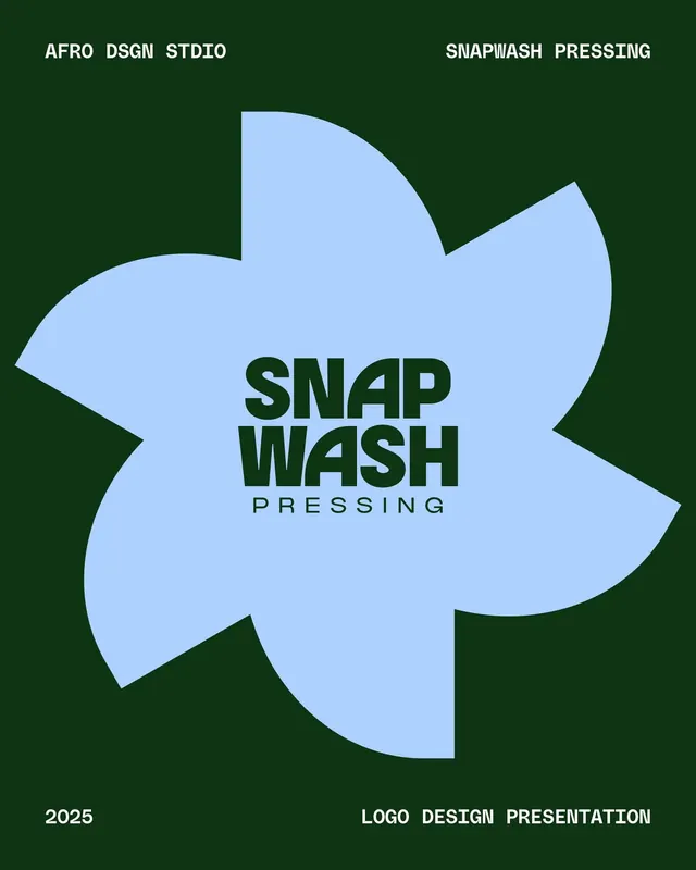
Laundry service logo pairing a soft, organic blob shape in sky blue with bold dark-green sans-serif wordmark on deep forest-green ground.
Summary
A laundry service logo pairing a soft, organic blob shape in sky blue with bold dark-green sans-serif wordmark on a deep forest-green ground.
Visual description
A light-blue blob shape dominates the composition, its edges gently curved and asymmetric, suggesting movement and a friendly aesthetic. Inside the blue shape, the wordmark "SNAP WASH" sits in a heavy, condensed sans-serif in dark forest green, with "PRESSING" in a lighter weight below. Above and below, "AFRO DSGN STDIO" and "SNAPWASH PRESSING" frame the mark in all-caps sans-serif. The background is a solid deep forest green, creating strong contrast against the sky-blue form. At the bottom, "2025" and "LOGO DESIGN PRESENTATION" provide context.
Key takeaway
The soft, organic blob as a modern alternative to strict geometric marks; the duotone palette leveraging warm neutrals and cool blues for legibility and personality; the hierarchy chain from brand identifier to service name to studio credit, using weight and case as visual anchors.
Reuse notes
Strong for service or consumer brands wanting approachability without sacrificing structure. The blob works well at small scale (social, favicon) and large (signage, environmental). Pair with warm, earthy typography for cozy retail or cold, technical san-serif for digital platforms.