Preview image. Unlock full-res
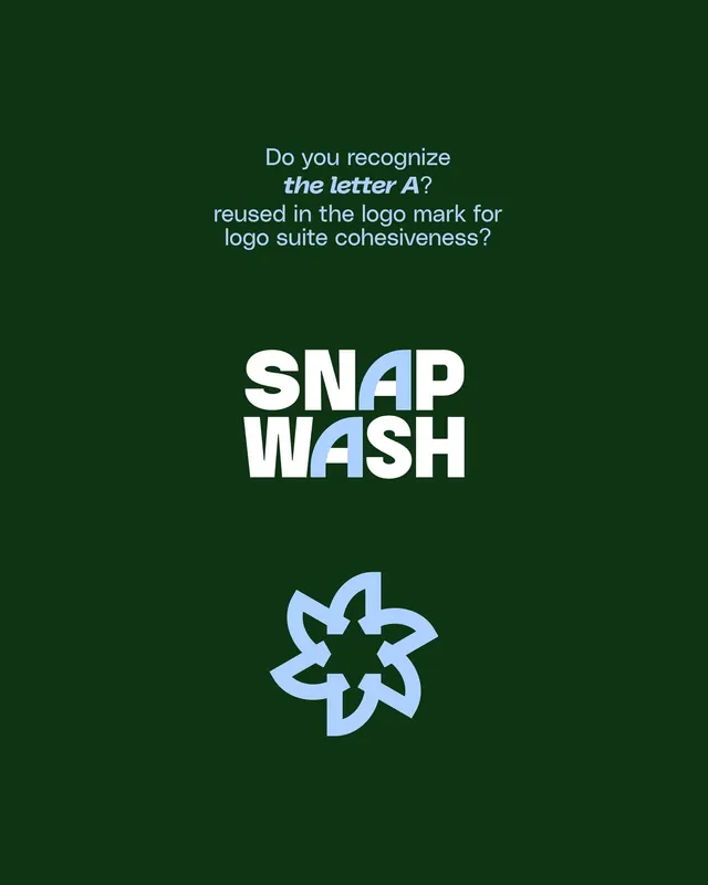
Logo identity for a laundry service featuring a bold wordmark with embedded letter-A form, centered on dark green with light blue secondary mark.
Summary
Service-industry logo for SNAP WASH featuring an oversized sans-serif wordmark with an embedded light-blue letter-A form, set on a dark hunter-green ground.
Visual description
Full-height composition on a solid dark green background. Centered, large sans-serif wordmark reading "SNAP WASH" in white, with the two A's featuring a cutout that reveals a light blue geometric form (a stylized star or multi-pointed shape) beneath. Below the wordmark sits a secondary blue star-form mark on its own, echoing the letter-A accent. Body text above the wordmark, in lighter gray-blue, poses a design question about the reused letter form. Simple, geometric sensibility throughout; generous vertical spacing.
Key takeaway
The clever reuse of a single geometric form (the star) as both an integral cutout within letterforms and as a standalone mark, creating a cohesive brand system from a single element. The dark-on-light reversal (white/blue on dark green) ensures legibility and perceived premium quality. The heavy-weight sans-serif makes the mark immediately recognizable at any size.
Reuse notes
Ideal for utilities, services, and consumer brands that need a memorable, scalable mark. The embedded-form technique works best with short, geometric wordmarks (two to three words). Dark green reads as trustworthy and sustainable; pair with light-tone copy or backgrounds for contrast. The secondary mark allows flexible placement across collateral and app interfaces.