Preview image. Unlock full-res
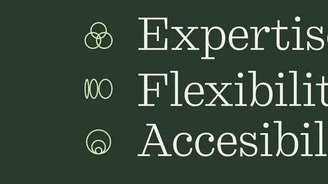
Type specimen pairing line-drawn icons with serif wordmarks to express three brand values on dark olive.
Summary
A typographic specimen for a brand values system pairing minimalist line icons with serif wordmarks (Expertis, Flexibilit, Accesibil) to communicate brand service pillars.
Visual description
Dark olive-green background displaying three stacked rows, each pairing a single geometric icon on the left (concentric circles, horizontal lines, concentric oval) with a tall serif word in cream-white on the right. The words appear to be truncated or styled service names. Small notation marks beside each icon indicate design variations or construction rules. Clean kerning and generous negative space emphasize sophistication and clarity.
Key takeaway
The icon-plus-wordmark pairing creates a compound signal (visual symbol + verbal claim) stronger than either alone; the restraint in color (two tones on dark) and the serif face choice elevate what could be a simple list into refined brand communication; the visible construction guides suggest a systematic, documented approach.
Reuse notes
Use for service-based or values-driven branding where you need to communicate multiple offerings or pillars concisely. The serif choice reads as established and thoughtful. Dark backgrounds with light type work well for B2B positioning. Suits identity systems where the logo system itself teaches users how the brand works.
More like this






Keep what you find
A free account saves references to boards and can send you a weekly email of picks based on what you save.
To see every result, go Pro.