Preview image. Unlock full-res
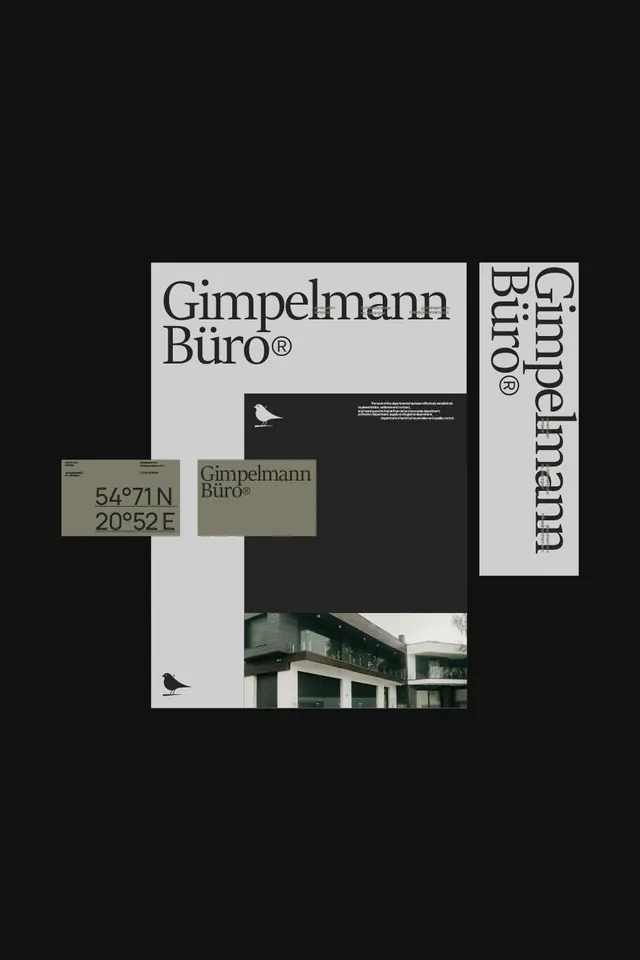
Architectural firm branding specimen with serif wordmark, coordinates, bird mark, and photography, organized across minimalist white and dark layouts.
Summary
Gimpelmann Büro architectural firm branding system with serif wordmark, geographic coordinates, bird motif, and layered collateral showcasing grid discipline and tonal restraint.
Visual description
A brand system specimen arranged across a black background showing multiple components in white and muted gray. The primary wordmark "Gimpelmann Büro" appears in a large serif typeface on a pale gray panel. A vertical-oriented sister wordmark appears on the right in the same serif, with rotated text reading "Gimpelmann Büro". A business card shows the coordinates "54°71 N 20°52 E" in geometric sans-serif, paired with a small outline bird mark. A dark panel below features a small bird silhouette and what appears to be fine print in white. The bottom includes an architectural photograph of a mid-century building with concrete and glass. The entire composition is unified by consistent typography, restrained color, and generous white space.
Key takeaway
The use of geographic coordinates as a brand identifier (uncommon, memorable). The pairing of elegant serif wordmark with minimal sans-serif coordinates. The disciplined asymmetric grid that separates logotype, supporting elements, and photography without cluttering. The bird mark as a repeatable symbol that works at multiple scales (large iconic, small secondary).
Reuse notes
Ideal for architecture, design, or consulting brands where restraint and precision signal expertise. The serif wordmark pairs well with corporate or luxury positioning. The geographic coordinates device is distinctive enough to work as a secondary identifier or emblem on stationery and signage.
More like this





Keep what you find
A free account saves references to boards and can send you a weekly email of picks based on what you save.
To see every result, go Pro.