Preview image. Unlock full-res
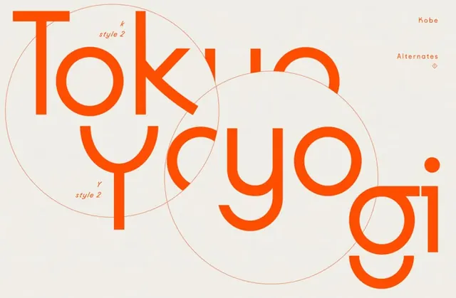
Bright orange wordmark using stacked, overlapping letter forms with visible geometric construction circles to reveal design system.
Summary
A rounded sans-serif wordmark where letter forms overlap and interlock across visible geometric construction circles, revealing the logo's design logic and assembly.
Visual description
Bright orange word (tokyou) on a light warm-gray background with overlapping rounded letters stacked vertically and horizontally. Two outlined circles (drawn in thin orange) show the geometric grids that guide the letter construction. Top-right annotations label "Kobe", "style 2", and "Alternates" with small scale indicators and style notes, documenting design variations. The letters themselves are chunky and friendly, with generous curves that fill the geometric shapes, creating visual tension between rigid geometry and warm rounded forms.
Key takeaway
The visible construction geometry transforms a simple wordmark into a teachable system, inviting viewers to understand how the logo was built; overlapping letters create a more dynamic, interconnected feeling than linear type; the contrast between soft rounded forms and hard geometric guides gives the logo both friendliness and credibility.
Reuse notes
Strong for brands seeking to appear thoughtful and designed (revealing the process builds trust). Works well in startup, creative, or tech contexts where showing your work is a value. The warm orange and rounded geometry skew friendly and modern without being cute. Consider using visible guides sparingly to avoid overloading; the best use shows just enough construction to be intriguing without becoming an illustration.