Preview image. Unlock full-res
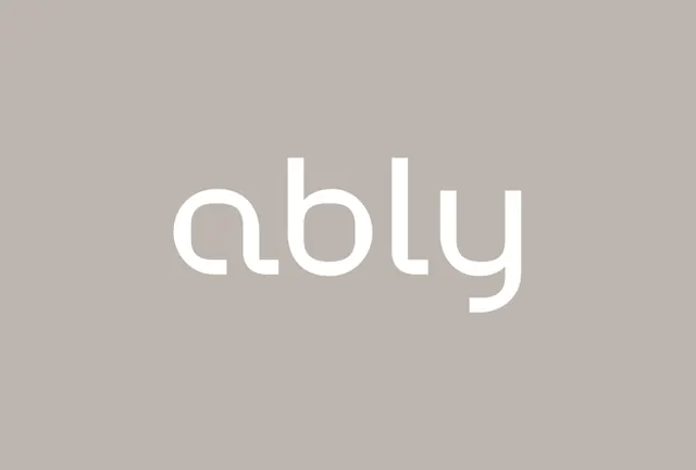
A minimalist wordmark in geometric sans-serif with subtle rounded terminals, set against a warm neutral background.
Summary
A minimalist wordmark in geometric sans-serif with subtle rounded terminals, set against a warm neutral background.
Visual description
The word "abLu" (with a lowercase 'L' and 'u') in white geometric sans-serif on a soft taupe-gray background. The typeface is light-weight with clean letterforms and slightly rounded stroke terminals, creating a modern yet serene appearance. The composition is centered and relies on negative space and color simplicity, with no additional marks or decorative elements. The contrast is subtle rather than stark, allowing the typography to breathe rather than dominate.
Key takeaway
The restraint in pairing light weight with subtle rounding for an elegant yet contemporary feel. The use of a warm-neutral background (not pure gray or white) to soften the overall impression while maintaining clarity. The all-lowercase letterform play (the 'L' and 'u' distinction) as a branding signature within minimalism.
Reuse notes
Effective for luxury or wellness brands seeking calm, professional positioning without coldness. Works well for startups or products in technology or lifestyle sectors wanting to project sophistication and openness. Pairs naturally with generous whitespace in layouts and photography-led websites. May read as too subtle for attention-hungry verticals (e-commerce, aggressive tech).