Preview image. Unlock full-res
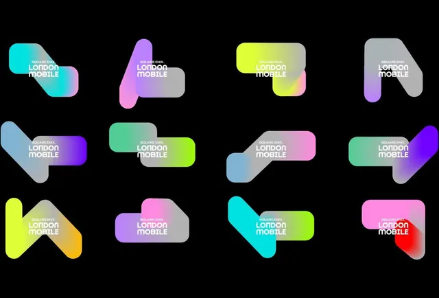
Twelve variations of a rounded geometric logo mark, each with a distinct vibrant gradient spanning cool-to-warm hues.
Summary
A typographic logo mark paired with 'LONDON MOBILE' in twelve colorways, each layering smooth gradients across complementary hues on a black ground.
Visual description
A twelve-piece grid on black background displaying a rounded, organic mark (composed of two interlocking curved shapes) rendered in different gradient combinations. Each variant pairs a primary hue (cyan, pink, lime, purple, blue-to-pink, teal-to-lime, grey-to-pink, magenta-to-red) with a secondary hue creating smooth transitions. White sans-serif wordmark 'SQUARE ENIX' and 'LONDON MOBILE' labels each version. The geometric form remains consistent while the color treatment shifts dramatically, emphasizing the system's flexibility.
Key takeaway
The modular approach to brand identity: showing twelve polished variants at once reinforces design flexibility without visual chaos. The gradient transitions feel premium rather than heavy because they move between adjacent hues, not opposite spectrum endpoints. Labeling each variant with the brand name anchors the mark's purpose.
Reuse notes
Effective for mobile apps, fintech, or tech brands needing to convey modern dynamism and adaptability. Works well as a mood-board or system showcase. The density of color variations would overwhelm a single application, so reserve this format for portfolios, pitch decks, or brand-identity presentation slides. Pair with a restricted primary palette in actual product UI.