Preview image. Unlock full-res
A lively, modular brand system for FROLIC using a saturated grid of hot pink, orange, yellow, green, and blue against deep burgundy, with pixelated wordmark treatment.
Summary
A lively, modular brand system for FROLIC using a saturated grid of hot pink, orange, yellow, green, and blue against deep burgundy, with pixelated wordmark treatment.
Visual description
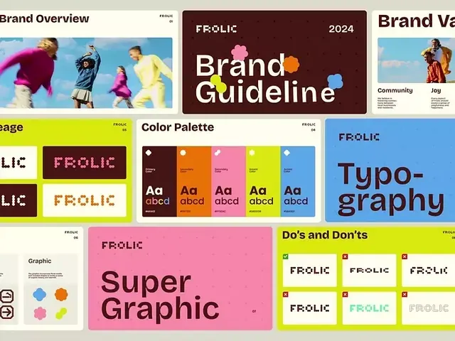
Multi-panel brand guideline layout showing the FROLIC identity system. Top left: brand overview with action photos of young people in vibrant apparel. Center: the FROLIC wordmark (pixelated, white serif capitals) on a deep burgundy rectangle labeled "Brand Guideline 2024". Right: brand values section with community messaging. Middle section: organized color palette with eight colors (burgundy, warm tan, hot pink, orange, acid yellow, lime green, sky blue) each labeled with hex values and displayed with typography samples showing "Aa abcd". Bottom left: the wordmark applied at full-size on yellow and white grounds. Bottom right: an extensive "Do's and Don'ts" grid showing the wordmark in correct forms (white on color, rotated, single-color) and incorrect applications (faded, condensed, misaligned).
Key takeaway
The discipline of a playful but structured color grid paired with a bold, pixelated wordmark that maintains legibility at any size. The "Do's and Don'ts" format as a practical guide that prevents brand misuse without being bureaucratic.
Reuse notes
Best for consumer apps, youth-facing brands, and agencies needing to demonstrate consistent application across contexts. Works especially well when the brand voice is energetic or playful. The color palette is saturated enough to work on both light and dark; the dark burgundy provides grounding.